Maybe it's just because I really like fighting really epic, difficult bossfights (my biggest disappointment with TP), but shouldn't a FINAL BOSS have more than that? Like, turn the entire stage into water that has whirlpools in it, and Link has to swim around to resist being drawn into the whirlpools, and dodging attacks for 30 seconds or something? Or, possibly, Meteors that the boss brings down, and stay on the screen, glowing, causing damage when Link touches them, then, after a few minutes, they suddenly burst, causing tons of damage? Or, maybe, even a stage where it mimics the other 8 bosses of the game? Or, a part where it turns the tower into a rocket and blasts the stage off into space, and everything becomes all zero-gravity? I mean, anything is possible...
Post screenshots of your quests here. [1.0]

This is the level one to my quest. I made it quite a long time ago now, originally iin Z1 graphics, but then I upgraded to Pure. I've improved them a lot recently - they were mostly bare rooms before. Just wondering what people think/could suggest to improve them. I'm generally not too pleased with my dungeons, this one is definately too linear.
Hm, that isn't too linear. Well, the best way to make it nonlinear is to have, obviously, branching pathways. On one side, have a key and a burnable block (in separate rooms, of course), and on the other side, have the locked door and the candle. That way, you are forced to go in rooms more than one time. Maybe have a few evilly-located one-way shutters. I always try to have the player go through rooms more than once, be it a 4-way room with a diagonal line of solid objects (so that only the N and W doors connect and the S and E doors connect), or even more than one door per wall. I mean, you'll never make dungeons as good as the Zelda team (unless you're a prodigy).
Revfan9 wrote:Maybe it's just because I really like fighting really epic, difficult boss fights (my biggest disappointment with TP), but shouldn't a FINAL BOSS have more than that? Like, turn the entire stage into water that has whirlpools in it, and Link has to swim around to resist being drawn into the whirlpools, and dodging attacks for 30 seconds or something? Or, possibly, Meteors that the boss brings down, and stay on the screen, glowing, causing damage when Link touches them, then, after a few minutes, they suddenly burst, causing tons of damage? Or, maybe, even a stage where it mimics the other 8 bosses of the game? Or, a part where it turns the tower into a rocket and blasts the stage off into space, and everything becomes all zero-gravity? I mean, anything is possible...
Sure, in 2.5. Let's bring your imagination back to 2.10. 😉 But it would be dang near impossible to have the tower change into a rocket and blast into space... :sweat: I have some things stored up my sleeve, don't worry. Maybe I'll have some of the stage change to poison water (which would just be damage combos), or maybe I'll have the boss bring his hands up high with just the shadow seen, which will get bigger, bigger... bigger... and it will slam on the ground. Or how about a ball of energy that zips across the stage randomly with only a second to predict where it will go? Don't worry, the battle won't be bland. 😊
heh, I meant more graphically - I'm not redesigning the whole dungeon anytime soon. My levels 2 and 4 are much better designed in my opinion - this was the first I ever made, and I tried to make it into a pretty shape rather than making it be a good dungeon ¬_¬
I know, I was only giving suggestions for future dungeons.
Aesthetics, eh? The biggest thing is to not make rooms square or the same shape room-to-room. Now, it is perfectly fine to have a few square rooms. Here is a shot right out of my current quest:

Notice that it is pretty square, but it's okay. There is a lot of decoration around the place (torches, scum on the walls, pots, etc.). I think there is even supposed to be a trap next to the door... It's been a while. 😛
Looking at your dungeon, I see water, pots, a couple cracks in the floor, those vine things on the walls; lot's of color. That's always good. I don't see any torches, but that's perfectly fine -- they aren't necessary (it's just a personal thing). The biggest thing in quest making is consistency, and it looks like that is pretty consistent.
So let me guess, it's a dungeon situated around or in a beach?
Oh ok, thanks.
Your room doesn't really look square, not with the different 'levels' in it anyway. The rooms look square in mine because this dungeon was originally for the Z1 tileset - and I wasn't using freeform dungeons. I'll try to do something about it
Well, its quite near the beach, but its actually meant to be the inside of a tree ¬_¬
Pineconn wrote:I mean, you'll never make dungeons as good as the Zelda team (unless you're a prodigy).
Ever played a game called The Minish Cap, or Twilight Princess? Trust me, surpassing the Zelda team isn't too hard.
Sure, in 2.5. Let's bring your imagination back to 2.10.
Uhh... All of those things I suggested were possible in 2.10. I made sure not to suggest anything that need 2.5 to work.
Well, it's not like I want to spend days on just having the tower change to a rocket. For sure it's possible, it would just take some massive combo cycling (if you wanted it to look nice).
Oh, come on. There was nothing wrong with Minish Cap or Twilight Princess. Many fans were just too overhyped about TP and nothing could have appeased them. I suggest you read [this]. You can't tell me that TP's dungeons were crap. They were excellent, MUCH BETTER THAN OCARINA OF TIME.
Anyway, I've already done the previous 8 bosses in Level 9. After you kill them, you get the Boss Key. But you inspired me to use wind (conveyors), that's a good idea.
funny how Revfan puts down good designers such as the official Zelda Team when we've yet to see anything positively decent from him. Sure a few graphical pictures, but graphics don't make design. They only enhance, they do not qualify as a complete product.
They only enhance, they do not qualify as a complete product.
I worry though. I mean, I know that my design is good, but I'm afraid my enviorments are just to Blah.
I've decided to look aroud and read some good overworld tips, and then redid my overworld in my recent quest: Heaven's Call.
Here's a shot from the new overworld:
I think I've improved in my overworld skills, considering this is what I used to do:
On a side note, I have a new siggy image. But for future generations...

Bwee hee heee!!!!!! I mean... Enjoy the show!

*whistles...*
whatever happened to your 'detail remains on the ground tiles and avoid filling up the screen with solid objects' advice Revfan? That screen seems 90% solid objects! XD
Wow, Blaman, that looks really nice. The only thing I could suggest is to put a sliver (or more if you want) of cloud in the sky in the northwest part of the shot.
DarkFlameWolf wrote:whatever happened to your 'detail remains on the ground tiles and avoid filling up the screen with solid objects' advice Revfan? That screen seems 90% solid objects! XD

What's suppossed to be walkable is walkable. There's plenty of room between the different types of objects, and a lot of this screen is water...
And BTW, that advice was with the DoR set, not the SD3 graphics...
... I think it's actually more of preference with how one uses a tileset. Like really, you don't have to use a tileset one way. You do that, and you might as well have ZC set into about 20 different quest makers and 5 graphics designers. I just feel compelled to note this after the latest few SotWs over at PureZC, where Zeldafreak supposedly used the SD3 tileset "wrong." The way he did it was more like preference in his own style. Granted, there were still a various amount of errors and mistakes, but it would hardly affect style of using a tileset. 5 trees MAX to one screen in DoR? You're bloody joking, right? I don't know where you live and I'm not sure whether that makes a difference in how you create screens or not, but have you ever been in a forest before? And then you stand next to a house. You find you could fit about 10 trees in the same space of the house, if not 15 or possibly even 20. I know this is Zelda Classic, and overpopulation of trees is bad idea (especially with the more typical sets like DoR and Pure), but having no more than 5 trees on even a forest screen isn't exactly... ... forest-like. It looks like a forest (those example shots you showed earlier) in how the foliage is used and all the shadows, but with practically no trees, it just doesn't feel like a forest.
... I apologize if the post leans slightly towards a rant towards one specific person almost, but again, I just needed to get that out.
Ah yes, while I'm at it... standard overworld shot in my quest (it's actually the first one you enter). Nothing fancy... definitely not SotW material... but decent enough for in game I figured. I'm open to minor suggestions in terms of seeing if I can add something else on the screen that's just a little different, but in general, I have no intention on changing the structuring of the screen... or the palette, for that matter...
(Hold on, I'm getting it up. Twill edit this in a bit. Nothin' ye should have to wait fer though, since, as I said, it twasn't anythin' overly good. Just an average DoR shot where I may have to cut one or two trees just for the sake of Revfan9. -_^)
WindStrike wrote:... I think it's actually more of preference with how one uses a tileset. Like really, you don't have to use a tileset one way. You do that, and you might as well have ZC set into about 20 different quest makers and 5 graphics designers. I just feel compelled to note this after the latest few SotWs over at PureZC, where Zeldafreak supposedly used the SD3 tileset "wrong." The way he did it was more like preference in his own style. Granted, there were still a various amount of errors and mistakes, but it would hardly affect style of using a tileset. 5 trees MAX to one screen in DoR? You're bloody joking, right? I don't know where you live and I'm not sure whether that makes a difference in how you create screens or not, but have you ever been in a forest before? And then you stand next to a house. You find you could fit about 10 trees in the same space of the house, if not 15 or possibly even 20. I know this is Zelda Classic, and overpopulation of trees is bad idea (especially with the more typical sets like DoR and Pure), but having no more than 5 trees on even a forest screen isn't exactly... ... forest-like. It looks like a forest (those example shots you showed earlier) in how the foliage is used and all the shadows, but with practically no trees, it just doesn't feel like a forest.
Again, I fully agree with what you said, but I disagree with what you ignored. Yes, forests have a lot of trees close together, but are they all really small, really square trees that look exactly the same? It's not a question of realism, but a question of what looks good. The GB trees (which everyone and their grandmother uses) look really, really bad when you use them right next to one another. Now, if you were using more realistic trees, and you had them all close together, then that is understandable, but the very unrealistic GB and LttP graphics (which, again, everyone and their grandmother uses) just doesn't work out for the way most people do forests.
Also, having trees right next to one another isn't realistic either. Look into any woods: Are the trees so densly packed that you can't move through them?
but you forgot the main thing about games Revfan, THEY ARE NOT SUPPOSED TO BE REALISTIC! We depart life into games to get away from the real and the reality of life. So to be NOT 100% true to nature is OKAY. Its not a crime. And the GB and LTTP trees do that job quite well. The only reason you dislike them is because they are overused and you'd rather stick with ripped graphics from less commonly used games so you can have something different. But that does not necessarily make it 'real.' It is still a game, regardless of how real you make it. So stop trying to go for realism and just go for the fun factor and the overall design of the screen, if that includes having trees jampacked together which lends itself to the overall desirability of the screen appearance, then by all means, do so. I'm tired of you slamming everyone else's work just because they can't or won't rip or use graphics that aren't already widely available. There is some good stuff out there, don't shut it down for the mere fact that its common.
DarkFlameWolf wrote:but you forgot the main thing about games Revfan, THEY ARE NOT SUPPOSED TO BE REALISTIC! We depart life into games to get away from the real and the reality of life. So to be NOT 100% true to nature is OKAY. Its not a crime. And the GB and LTTP trees do that job quite well. The only reason you dislike them is because they are overused and you'd rather stick with ripped graphics from less commonly used games so you can have something different. But that does not necessarily make it 'real.' It is still a game, regardless of how real you make it. So stop trying to go for realism and just go for the fun factor and the overall design of the screen, if that includes having trees jampacked together which lends itself to the overall desirability of the screen appearance, then by all means, do so. I'm tired of you slamming everyone else's work just because they can't or won't rip or use graphics that aren't already widely available. There is some good stuff out there, don't shut it down for the mere fact that its common.
I'm not saying they should do it realistically. I am saying they should do it in the way that looks the best. DoR can be a magnificent-looking tileset, but everyone except Radien uses it incorrectly...
well here's a thought, demonstrate a screenshot that uses it incorrectly and a screenshot of Radien that uses it correctly. (now for the one that is incorrectly, don't go cheap and display one that is OBVIOUSLY bad, try to compare with one that is quite good and decent yet still isn't using it 'supposedly' correctly. Don't want to stack the deck shall we?)
Oh, well... here's that shot I promised earlier. As I said, nothin' fancy at all. I probably still need to adjust the palettes just a little more... but fer now, 'ere it is: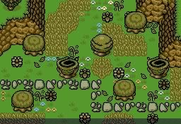
EDIT: God that looks odd when changed from fullscreen in WIDESCREEN to suddenly small, when it's no longer sized to widescreen! Oh well...
And allow me to get a point through that I think DFW is also attempting to get out (though she's already thrown out a lot of extremely good points). There is no incorrect way to use a tileset. Ok, EXCLUDING PLACING RANDOM TILES AROUND THE SCREEN. Just so you don't contradict it so easily. Sure, there's better-looking ways... but there'll never this one absolute way that EVERYONE will agree upon to be like, THE BEST and THE ONE WAY (to rule them all!). Seriously, I'll reinstate this, and add something to it: Preference/style + skill of zquest/screen construction. There'll NEVER EVER be ONE CORRECT way to use DoR given that. Also, do note that Radien has access to an upgraded version of DoR (out of what I've seen from the SotWs, oh yeah), so that does technically give him the advantage on that premise.
... also, Revfan9... heh... if you say EVERYONE but Radien CAN'T use the DoR set... how is it that manage to give oh ever-so HELPFUL hints on how to use it if you ALSO don't know how to use it? You did say "everyone," right? 😊
Mwahahahahahahaaahahaaaa!!!
Usually, I don't fiddle with DoR, but out of boredom, I started changing some of the level palette colors....
Old: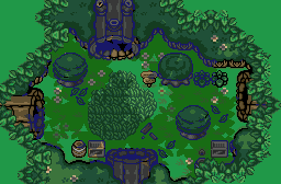
New: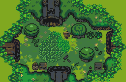
I think this new "Main" palette is more suitable for grassy areas. It feels much more vibrant and full of life.
Old: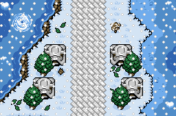
New: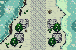
This new Winter palette is trying to be more silent, more cold looking. The old one is very vibrant and cartoony, which I don't think suits a harsh, winter setting very well.
Interesting... I may actually have to steal (but still credit) those two palettes and see how well they work in my quest. I'm starting to get a little bored with my eastern overworld palette and have begun tweaking it slightly, but it never came to my tastes, and I wanted a palette similar to it but still capturing the feel (actually, I still to get the feel of the area in many of the screens).
And the winter one... oh yes, that'd be far considerably better most definitely - just what I need. Thanks Revfan! (I'd still need the permission to use these of course, if that's alright with ye)
The only problem I find with the grassy palette is that the tree shadows actually kinda block out some of the texture - I can hardly see the grass that you could originally see from the old palette. But it's not like that'd matter for me, because I wouldn't use that palette for the forest in my quest... well... at least, I'm not entirely considering it yet... though I may if I can't get a better layout for the forest given that "spring" palette.
As always, anything I make is free to use. And don't worry about the tree shadows, that's just Zquest not showing the transparency correctly (too lazy to do a player shot). Just like how the black outlines are replaced with blue in the old palette shot...
And here's a nice nighttime palette (IMO, anyhow), and again, Zquest messed a few things up with the transparency:
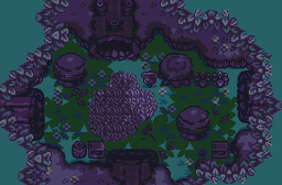
...You do know that if you press "B" while in ZQuest, the transparency will fix itself (usually), right?
I agree, I think the snowy palette looks very nice compared to the old one. As for the forest palette, I think the new one can be a new palette by itself and not replace the old one. Both have their own time-of-day setting, but I must admit, I like the new one better.
Here's my older shot revamped!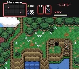
Hmm... the trees are still way overused, the grass still sucks, and the white flowers feel rather repetetive. Nice try, however.
Got some new Ice for level 1 in my quest, the Frost Temple. Took a bit of editing to get it to work, but I like it a lot. Cookie to anyone who guesses where it is from... :P
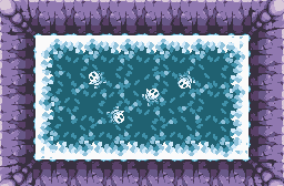
Some Mario game with Shy Guys in it?
some Yoshi's Island game.