What tile set did I use?
I used PTUX with some additions from stuff I found at PZC.
Post screenshots of your quests here. [1.0]

...That moon looks like crap. Ah well. Guess that's what I get for going 2 months without ripping a single thing, and ripping from a NASA shot at that. I guess it's also 'cuz the moon is hyper-realistic, and nothing else is, so it just clashes. Ah well. *bangs head against wall* I had almost forgotten how incredibly easy it is to rip stuff into ZC tho, even in 4-bit.
And, Gleeock. I took a look at that palette for your castle, and it's an absolute mess.
It looks like, at first, that you're using 8-bit mode on the OW Csets (Which is smart IMO, that's what I always did for my tiles). But, upon closer inspection, you had Black as the first color in each Cset, so that means that you're doing 3 layers, 1 of each Cset, to make the castle, which makes a deep fragment of my soul very, very sad for some reason D:
So, I went ahead and got the colors of the castle from that shot all into a single Cset. Although there are probably more colors used in other parts of the tilesheet, so, if you want, PM me the tile sheet and I'll be kind enough to organize it (the palette) for you, k?

Gleeok's castle looks fine to me.
Revfan, that moon looks pretty good. The screen in general looks good. Is my assuption that this project will get scrapped and never be released correct? And I see nothing wrong with Gleok's castle.
Revfan9 wrote:...That moon looks like crap. Ah well. Guess that's what I get for going 2 months without ripping a single thing, and ripping from a NASA shot at that. I guess it's also 'cuz the moon is hyper-realistic, and nothing else is, so it just clashes. Ah well. *bangs head against wall* I had almost forgotten how incredibly easy it is to rip stuff into ZC tho, even in 4-bit.
And, Gleeock. I took a look at that palette for your castle, and it's an absolute mess.
It looks like, at first, that you're using 8-bit mode on the OW Csets (Which is smart IMO, that's what I always did for my tiles). But, upon closer inspection, you had Black as the first color in each Cset, so that means that you're doing 3 layers, 1 of each Cset, to make the castle, which makes a deep fragment of my soul very, very sad for some reason D:
So, I went ahead and got the colors of the castle from that shot all into a single Cset. Although there are probably more colors used in other parts of the tilesheet, so, if you want, PM me the tile sheet and I'll be kind enough to organize it (the palette) for you, k?
Actually that moon looks great. Better than great actually. I dare anyone to find an 8-bit game with a better looking moon than that...seriously. From the perspective your seeing it, the only thing that might be out of place would be the clouds. If you had like layer 6 and 7 clouds that were up to par with that moon, you'd have probably one of the greatest ZC shots ever. Something to stick on the front page of zc.com.
Actually believe it or not, the way I have it set up is that entire screen is, I believe, lv pallette 3c, cset 4. It's 16 colors, the first being black. It's actually pretty organized, cset 3 is interiors and cset 2 is interiors for NPC's, shops, castle decors, that sort of thing. I always(usually) edit the palletes outside of zc before ripping them if they're 8-bit or 24-bit graphics.
And.....that is actually layer 0. There are no layers in that screenshot. There will be some lightning and rain probably when I get done with it though.
I'll put some more shots up later if you wan't to rip them, although that's most of them right there...But i've got some Tower of Bab-il, and ps1 Mysidian tower maps almost completed....and i'm rambling.....
-Revfan, you seem to be very talented at graphics. Why does everyone say that you'll never release anything? Do you just mess around with it for fun, or do you think that the graphics aren't good enough? I can't comment on gameplay, but your pics look pretty friggin good to me.
Revfan9 wrote:
I think what the moon needs is some kind of aura around it. The moon is too sharp on that black background, so it needs some sort of "glow" around it so it would blend in a little better. Ever think about realistic stars instead of those blue things, too?
Salamander: Volcano zone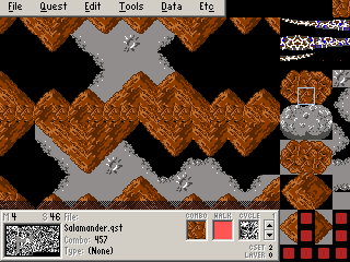
Just curious Old-Skool if you are using scripts for the weapons and enemies.
Anyway I posted some of these tiles in the other thread, but here are some actual screenies:
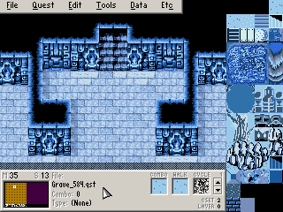 Is it cold in here?
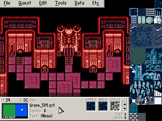 Some recoloring.
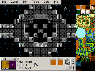 Aah, memories.
Had them just laying around, it would have been a waste to not post them. 😛
Those are nice Gleeok, where are they from?

Where are you going with that sword?!
oo and my subscreen: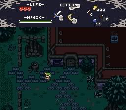
Gleeok wrote:Just curious Old-Skool if you are using scripts for the weapons and enemies.
That's my plan, for Tetran, Golem, etc, but I have no idea how to go about it...
All the main guns are arrows, laser being a golden arrow... I need to alter the trails somehow so it has seperate horizontal and vertical tiles, and doesn't scatter about. Just stays in one line. Also, there's the issue of missiles, and maybe even scripting in options!
Zelvania, the source of global warming, and algore's future home. 😉
Here's a section of the caverns, still haven't decided on a name yet

 Jesus holy Christ, that looks completely incredible. No AGN smiley matched my expression, so I had to search for another.
All fanaticism aside, that does look very good. Though I'm sure you didn't make those graphics from scratch. 😉 I presume that you are indeed making a quest with these all these sideview areas?
The graphics are ripped from DraculaX and then edited pretty heavy.
Much work in what you see. 😉
I'm making those side scroller areas in SwanSong ~ Genesis as passageways basically, most are just short little areas of 8 to 16 screens per section, but a level might end up having several sections of those. 😉
I see much work in what I see. Yet again, it looks incredibly... incredible.
I can say that I'm definitely looking forward to your quest if at least a portion of it boasts those quality graphics.

Started making Winter Garden for NeoFirst. This is the entrance screen, right in the center of the dungeon. Odd, but that's how it's going to stay.
Winter Garden is the place originally known as "???" on the original map. You'll be going to all four corners of the dungeon to trigger switches and get the three keys needed to get to the Winter Element.
Wow! Nice screenshot! I wish I had that much artistc skill...
Oh wow. That's a really good shot! 😃 I've got no complaints.
Here's a shot from the forest area in LoRII that I started making: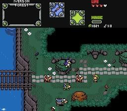
can anyone critique these screens before I start replacing the duplicates of them please?
I could critique you loosing life while taking screenshots. But that would make me a jerk.
[btw, fantastic menu graphics Joe123, absolutely fantastic, I need to stop by here more often]
urm, thanks I think then, although telling me losing health is bad isn't going to help me improve the screens. What can I do better on them anyone?
I'm not seeing anything bad, but I don't know what you're trying to do either.
Joe123 wrote:urm, thanks I think then, although telling me losing health is bad isn't going to help me improve the screens. What can I do better on them anyone?
I will tell you. And I'll put it in caps for effect....
THERE'S NOTHING WRONG WITH THOSE SCREENS OR LAYERS...
...suppose someone said "it's too green", and you made it less green. Then it would be less of the lush forest as you have made it. What about "You have too much open space", then if you added a crap load of unwalkable combos it would detract from the experience of the player traversing through your "maze-like" forest and focus on slashing combos way too many times just to get from screen to screen.
IMO, the relationship of graphical-overabundance and game play is counterintuitive.
...In fact, i'll color that statement.
And in closing, the yellow colorization of sentences is reserved for me. You may not use that color. 😛
Joe, those screens are WONDRFUL! Perfection at work. Nothing is wrong with them at all.
In conclusion: You make wonderful overworld screens!
[COLOR=black]And in closing, the yellow colorization of sentences is reserved for me. You may not use that color. 😛
[/COLOR]Blue is now my color. 😛
http://i197.photobucket.com/albums/aa76/gray0x/zelda001.jpg
The Museum

http://i197.photobucket.com/albums/aa76/gray0x/zelda002.jpg
The 3 Children of the Cosmo's Crescent standing in Triumph Town, Cell (you), Embra (girl), and Gabriel (black clothes)

http://i197.photobucket.com/albums/aa76/gray0x/zelda003-1.jpg
??? Where are you?

By the way, the quest is a sidescroller, except for towns. Them are IMPOSSIBLE to make O_O
well, thanks everyone, although I'm still not completely pleased with them. I don't really like the way I use the brush for some reason. I also tried making a better small burnable bush, that looked a little like the new LTTP trees, but it looked awful.
Gleeok wrote:
IMO, the relationship of graphical-overabundance and game play is counterintuitive.
What's this meant to mean
oooo, it's so close to yellow!
Seriously though, what is it meant to mean? 😕
So I'll make it blue, and only have the direct pathways walkable yeah Gleeok? :P
You guys are too nice though, where's Revfan when you need him...
Those screens are looking pretty good grayOx, although the parts where half of those pillars stick out of the floor look a little unusual. It might look better if you put them on the floor, and had them just as decorations that you walk infront of. Perhaps.
Is this going to be a true sidescroller with the Roc's feather and all that?
And AoL managed to make sidescrolling towns preeeetty well I though :P
Custom Boss shots from Facade. And closer to yellow! 😊


EDIT: Oh, so we're "calling" colors now? Is green taken?
More bosses. These one's are from Lv4.

The guardian of the level where the guardian of the master sword awaits...
...damn, that's alot of work.

Scripted boss Lich. He's a bit overpowered right now due to the fact that
he has 8 ffc projectile attacks, :laughing: and a rotating shield that
regenerates his HP, along with the Nuke spell...I'm trying to balance that out a little as he's currently unbeatable....hmm.
ps- franpa, check your demo thread.
Having Z1 Link sprites and Minish Cap walls really clashes.
Interesting sounding bosses though, I wish I could script things like that.
So now I'm quite pleased with my wood, what do people think of my town?
Your Village looks awesome, Joe!
And I still agree that the classic-looking Link Sprite clashes much with the surroundings. The bosses look amazing, however.