Man, you know this thread is inactive when six months get lost, and you only lose four posts.
Post screenshots of your quests here. [1.0]
Oh, that's lovely. 😊 overworlds like this are always fun to look at and explore.
So, people do look at this thread 😛
This is the northern part of a 16x16 overworld I'm making. there's more done now, and part of the south has been done too. I'm just working in this in the mean time, since I'm waiting on some paper work, and stuff. I am liking it way more than ZTD's overworld. In fact, most of ZTD's overworld is kinda crap. It was made over five years ago, and it shows especially next to the newer areas 😮
Allusions, allusions...
Were it not for the fact that it's a Sunday and I still have homework to do, I'd be compelled to just open up ZQuest and mess around with the Classic set and create something along the lines of that. I particularly like the waterfall area and the orange-ish mountain area, but really all of it is just fun to look at (and, hopefully, to play through).
Ooh, a chutes and ladders style classic overworld! Or that is at least what I like to call it. Reminds me a bit of Molka in the western half. Nice stuff there, Anthus.
Wow Anthus, for a map made with the classic set that does look amazing! Oh man I am happy to see some good classic work. 😊
I'm glad it was so well received. Thanks guys. As for the "chutes and ladders" style, I was going for making a gameboy/ pure styled overworld with minimalist means.

I recently got into Zelda Classic from viewing questmakers ideas. This is a shot from my inspiration.
Thanks to:
Radien
Akkabus
Russ
Nuvo
Prospekt
Furion
Good shot there, I like your idea of a screen with enhanced Classic tiles. I can point out the goods and the bads of this shot according to my tastes.
The Good 😊:
Enhanced Classic tiles (as said above).
Nice choice of pallet.
Good layout.
The Bad 😞:
Waaay too much contrast between the black and white ground.
Not so 😕:
The perspective that some of the trees use.
Overall, this looks good but you could darken the white or lighten up the black a little bit and try changing the perspective that some of the trees use. Thats my 2 [STRIKE]cents[/STRIKE] rupees.
Edit: how do you put striked-out letters. I tried, but it came out broken.
Edit2: Thanks Spyk, those letters now came out correct
Edit: how do you put striked-out letters. I tried, but it came out broken.
[strike]That would be[/strike] [strike]. 😉

Another rehash at my last subscreen. What do you all think?
The dark space in the upper half is where the triforce pieces would go in the overworld, but where the dungeon mini-map would go when you're in a dungeon.
In the lower passive subscreen, I eliminated the sword button icon, because, we all know you're going to be carrying the sword around 24/7 so why visualize it? So the only icon you see up is the B button item, alongside the counters. In the middle is the mini-map plus the title of it.
Some say it may clash with the GB tileset, but I personally like it. It makes the colored items pop out more. Anyway, it isn't a screenshot of a quest per sey, but it is an image from a quest. :P
Now to add the compulsory "Woot your making a new quest DFW?".
Suh-weet subscreen, I must say. I wish I had the motivation to make a new quest, but not until 2.5 is done. Which implies never, unfortunately.
franpa wrote:Now to add the compulsory "Woot your making a new quest DFW?".
Not saying anything yet. Just saying here's a new subscreen! Yayz! :P
Something im working on! looky transparent water with out transparent layers, and you can see link under that transparent water? yeah!
http://www.dropmocks.com/mG7H1
Nice subscreen dfw looks kinda familiar though  I made this long ago though lol I like yours better though 😉
100% custom tiles I drew, for bar/inn/house
And here �s a side scroll.
ennonfenom wrote:Nice subscreen dfw looks kinda familiar though
Haha, that subscreen looks [strike]good[/strike]amazing! And DarkFlameWolf's is no different, but I favor this one a bit more. If only I could make these good of subscreens and graphics. 😞
Not quite a screenshot, but here's a video of Zelda~TD.
RRRRRRRRRRRRRRGGGGGHAAAAA I'M NOT DONE MAKING THIS QUEST YET!!!!!!
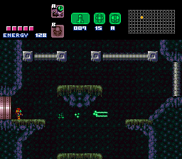
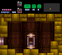
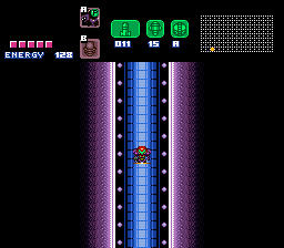
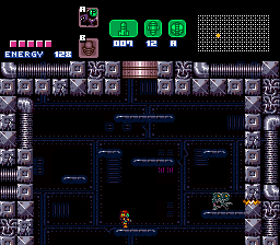
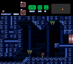


Attachments:
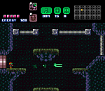
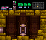
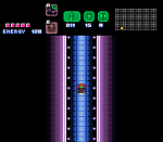
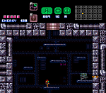
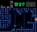


These are from my quest Tropicana Island which is roughly finished 95%
http://www.purezc.com/forums/index.php?showtopic=51738


continued (maximum of four images per post... I want to show six)
Sticks And Stones from http://trudatmangames.blogspot.com
the Aquamentus:
other items: