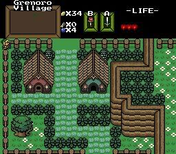
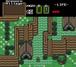
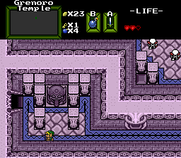
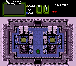
Pineconn wrote:Spyk99999, can I ask what tileset you are using?
Descendant Tiles. I didn't notice that the tileset looked flat before.🙄
I don't like the hearts too much either. I'll probably edit them. (and hope they look any better😊)
First off, never, ever use JPGs. Use GIFs or PNGs for everything related to Zelda Classic.
I usually use GIFs. I think ZC was set to make JPGs.
Second, I commend the use of the Descendant Tileset. It's most certainly one of the better "Pure Clones" out there (Although technically the Descendant Set came first).
The thing I don't like about it is it don't have a lot of variety.
Tip: Importing stuff into ZC isn't hard.
Revfan9 wrote:Decided to give custom tilework a shot again: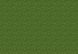
Tis a bit... empty I know. I spent 3 fucking hours getting that grass to be in any presentable form, and it still looks like total shit. Expect it to be filled up with objects as I find the time to draw them. I basically just repeated the grass tiles on the screen to show how it looks when used. Until then, thoughts and advice on the grass/palette? I totally fail at life when it comes to this crap...
Hmm... I dunno Revfan... I do actually like it... Now, I don't like the palette... Try changing it to somthing better... Cause those grass tiles looks... Cool...
Seeing Spyk's shots made me wanna mess around with the Descendant set, so I did.
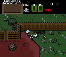
Also completely unmodified tileset, which is rare for me.
Nice looking Revfan. Only criticism is that the plant feels out of theme with the graveyard, but thats entirely your call.
I sortof figured out a long time ago that Gameboy tiles look best when you use solid objects sparingly. *shrug*
Revfan9 wrote:
My opinion is that the brightest green is, in fact, too bright. I would suggest darkening that color just a tad to make it blend better.
Revfan9 wrote:Seeing Spyk's shots made me wanna mess around with the Descendant set, so I did.
Also completely unmodified tileset, which is rare for me.
Uhh... I'm gonna pull a Revfan here :3
But no... I must say... I do not like that at all...
Not to be... mean or anything, but it looks like one of BillyRonalds shots... and the guys over at pure knows that THAT is kinda bad... :P
First off, the mountain usage is... baad... and STRAIGHT! Make some curves man!
And no, GB tiles does not, in my opinion, look better when used sparingly... you should pop the screen full of unwalkable objects... And for the love of god, cover ALL corners whenever possible... Please?
I don't like the palette either...
that screen looks annoying to play... If a quest was full of shots like that, I'd stop playing... INSTANTLY...
Though, this is my opinion :3
Curves? You can't do curves with the GB mountains, unless you mean to make it like Tal Tal heights from LA where there's only 3 walkable tiles on every screen :/
Trying to do anything more complex than that with those mountains makes the screen look too "busy".
Corners? I understand the concern, but it was a shot intended to be actually part of a game. When you're making screens for an actual quest, you have to consider the entire map as a whole, not just that one screen. Covering up the corners makes the individual screens look better, but when you take a look at the whole map, it makes it look and feel more like a laid-out maze for a little rat to run through, rather than a natural world.
And again, completely unmodified tileset, so there's not much available in terms of colors and tiles.
Revfan9 wrote:Curves? You can't do curves with the GB mountains, unless you mean to make it like Tal Tal heights from LA where there's only 3 walkable tiles on every screen :/Trying to do anything more complex than that with those mountains makes the screen look too "busy".
Corners? I understand the concern, but it was a shot intended to be actually part of a game. When you're making screens for an actual quest, you have to consider the entire map as a whole, not just that one screen. Covering up the corners makes the individual screens look better, but when you take a look at the whole map, it makes it look and feel more like a laid-out maze for a little rat to run through, rather than a natural world.
And again, completely unmodified tileset, so there's not much available in terms of colors and tiles.
Ahem... I think covering corners may look good in a map too...
And I'm using this, allthough unfinished, with... some awfull bushes, really, to prove it!
http://i4.photobucket.com/albums/y145/kallepus/zelda237.gif
That is just awsome. I don't have any complaints. Damn, I wish I could an overworld like that. Excellent job on that! :thumbsup:
EDIT: Wow, I just realized how choppy my post is... >_< Lol!
what tileset is that Migo?

Recent screenshot showing off the water tiles I just finished bringing over to the new setup (Tileset went through a bit of a change). Yes, the subscreen has yet to be finished
Draw more details for the dirt. It's really annoying to look at in it's current state, too much repetition.
*b* wrote:Recent screenshot showing off the water tiles I just finished bringing over to the new setup (Tileset went through a bit of a change). Yes, the subscreen has yet to be finished
Is that red bar Life or Magic? Or something altogether different?
Life. Magic isn't used in this quest, but it is in the sequel. As I said, the subscreen is very incomplete
It looks very advanced already, in my eyes.
[highlight]*NOTE*[/highlight]
We'll be starting up a Screenshot of the Week contest very soon in the AGN Expo forum. Since a lot of screenshot swapping occurs here, I figured you'd like to know about it. I expect seeing some nice entries soon! Only a community can keep a project going....
*b*, that's a very nice shot. I think Revfan was right about the repetitive dirt (but it's really not too bad). The water is made of pure epic win.
Pineconn wrote:*b*, that's a very nice shot. I think Revfan was right about the repetitive dirt (but it's really not too bad). The water is made of pure epic win.
Yeah, I know. I'm working on ways to break it up, with some small rocks and patches of grass. I'm trying to avoid using layers as much as I can, though I don't think that's an option here
Here is something from me that is totally 100% Done by me, I Did not start from any tile set, just opened up a new blank qst, edited the palettes and hand drew all tiles seen here:

Here are some screenshots of my recently-rereleased Son of the Beach Fun Quest:


/me eagerly awaits Revfan's reply ripping them apart...
So you mean go freeform :tongue:. I'm assuming Janine was going for the first quest feel and left it more or less the same.
bobrocks95 wrote:So you mean go freeform :tongue:. I'm assuming Janine was going for the first quest feel and left it more or less the same.
Well, even if freeform dungeon are out of the question, it's still easy to make non square rooms.
Wouldn't that back-fire though if there's a shutter door that's not in the middle, since Link wouldn't walk forward and would get stuck in the shutter if the rule isn't checked?