Come on now, let's not all beat up on Revfan.
Post screenshots of your quests here. [1.0]
Aw, man. Can I take one quick whack? I haven't yet experienced first-hand Revfan's critique, but I know and have seen how much he seems to criticize.
Being constructive doesn't mean you tear everything apart like it was put together in a junkyard. It means you tell both the positive and the negative features of what is presented. If someone hears nothing but negative things about their screenshot, they usually just get overwhelmed and they have no idea what bad things to change and what good things to keep the same. If you do nothing but criticize other people's stuff you just become a rabid snake who's hated by everyone.
For what it's worth, I like everything that's been posted in this thread in the past week or so. It's all a lot better than I could ever make. I like the fact that Revfan is doing Terranigma. I played with the idea of trying a Terranigma tileset way back in ZC's early days but decided it would be way too much.
Sam Atoms wrote:I like the fact that Revfan is doing Terranigma. I played with the idea of trying a Terranigma tileset way back in ZC's early days but decided it would be way too much.
Where'd that come from? I'm not currently working on anything related to TN.
An interesting predicament indeed.
*Strokes non-existent goatee*
That aside, if you don't like my opinions, I say you follow Freedom's advice and put me on ignore. I'm going to tell people what is wrong with their work instead of every post being a mindless "Good job!". Again, don't like it, don't read it.
I'm with Sam Atoms. While I see that you offer constructive criticism, you don't offer any positive points. People need to know what they are doing good on in quest making so that they continue to do that.
Revfan9 wrote:That aside, if you don't like my opinions, I say you follow Freedom's advice and put me on ignore. I'm going to tell people what is wrong with their work instead of every post being a mindless "Good job!". Again, don't like it, don't read it.
It's what YOU think is wrong and it's ONLY YOUR OPINION.
I've seen some of your screens that I thought were god awful but I was polite enough to let you work through them and develop your own style.
You should show others the same consideration.
Just because YOU think something is wrong with someones screen doesn't make it wrong, and the way you express that opinion often makes you look like a pompous ass.
In addition, your criticizing Alphadawg's work from over 4 years ago was over the top.
Alphadawg has done far more for Zelda Classic then you'll ever do, and he's been gone for the last 4 years.
This forum is a place for people to share their work, not a place for you to hang out like a vulture waiting to insult everyone who dare post a screenshot.
Show some consideration.
so yay, let's post some screenshots in this thread again! 😃

Old images, I know. But just to get the ball rolling again. x_X
I've got a quest. 's called NeoFirst.


Freedom wrote:It's what YOU think is wrong and it's ONLY YOUR OPINION.
That's what I already said. Again, if you don't like my opinions, don't read them.
I've seen some of your screens that I thought were god awful but I was polite enough to let you work through them and develop your own style.
That's my entire point. If you see something wrong with any of my screens, please, tear into them as hard as I do. Because you were "Polite", my work suffered.
You should show others the same consideration.
Just because YOU think something is wrong with someones screen doesn't make it wrong, and the way you express that opinion often makes you look like a pompous ass.
Once again. Don't like my opinions, don't read them.
In addition, your criticizing Alphadawg's work from over 4 years ago was over the top.
Alphadawg has done far more for Zelda Classic then you'll ever do, and he's
been gone for the last 4 years.This forum is a place for people to share their work, not a place for you to hang out like a vulture waiting to insult everyone who dare post a screenshot.
Show some consideration.
And? That doesn't excuse any lack of quality. Silver Surfer was made back in the 80's, so I can't say it's a bad game? That aside, my only complaint against Alphadawg's screenshots were the blinding colors, which, even 4 years ago, were nowhere near being outside of his capability of controlling.
I must say... I'm with Revfan here... I don't believe in not saying what you think is wrong...
I mean... If I see a bad screen... I really do rip into it... Not to be mean, but to make em learn...
When I was new, my screens REALLY sucked... Then, Darkspawn came along... and said what he thought about them... Now, I'm happy with my screens...
So I don't think you should all go agains Revfan here... And he IS only saying what he thinks aobut them...
You should see some of my posts to some of billyronalds screens, over at Pure...
Heh... Poor kid...
A person need not be a dickhead to encourage better work from others.
Freedom wrote:A person need not be a dickhead to encourage better work from others.
That is very true...
And I do agree... Completly...
Well Freedom's just as good at bitching as I am, and I at least know that you can't out-bitch me. *shrug*
To get back on topic, new DoR palette I made.

Still incomplete, went for something dark and "Realistic". Maybe for a graveyard or a swamp?
Revfan9 wrote:And? That doesn't excuse any lack of quality. Silver Surfer was made back in the 80's, so I can't say it's a bad game? That aside, my only complaint against Alphadawg's screenshots were the blinding colors, which, even 4 years ago, were nowhere near being outside of his capability of controlling.You absolutely can say Silver Surfer sucks ass! I sincerely hope you were citing that piece of crap merely as an example of old shit that has always sucked and always will and not comparing Sarpadia to that piece of binary garbage.
(There's one thing we have in common, we're both AVGN fans! There's no way you mentioned Silver Surfer by pure coincidence. By the way, he has a new Intellivision video up... I'm going to check it out shortly.)
Anyway, back on topic... what's "blinding colors" to one person is perfectly fine to another. That's a matter of personal preference, there's not much I can do about that. You can't please all people all the time. Also, like I said earlier, most of Sarpadia's palettes were ripped directly from Zelda 2 screenshots. I suppose then, by extension, Zelda 2's colors were a little too blinding for you?
I also conceded I suck when it comes to graphics. I'm much better at other aspects of quest design (and there are others, many others in fact).
Is there a place for constructive criticism in this thread? Sure. Should some of what's been posted lately perhaps been toned down a bit? Maybe. It took you, what, all of two minutes after I posted my Sarpadia screenshots to reply ripping into them? I'm a grown man and I can take some tough criticism, but I could definitely understand how some people may be reluctant to contribute screenshots to this thread with the current atmosphere.
I watched the Intellivision video yesterday it was decent at least once he actually got into the reviews. Seriously, why does it take half the video before that stupid "Double Vision" song ends?
I have been afraid to post here for a while with the constant atmosphere that is Revfan. And I believe that it is the WAY that Revfan criticizes people that makes us all mad. As Freedom said, it makes you look like a pompous ass.
If you hadn't already noticed, I sortof AM a pompus ass :/
touche
Joe123 wrote:Please find some decent palettes for them, DoR's default overworld palette is horrible...
And do you have any dungeon shots from it you could post?
First, if you have a suggestion for a good palette that has the same feel as the original, please let me know. The important thing is that it needs to feel like the original.
Second, I don't really have enough to show off dungeon wise. I have started redoing everything, and I've only redone parts of level 1 and 2 so far.
Amaster42 wrote:Well, now I'm really conflicted. Every screen that seems okay to me seems really empty to you guys, and every screen that seems good to you seems really overcrowded to me. I'm worried about my overworlds reception now.
Hey, I think the same way you do when it comes to overworlds.
DarkFlameWolf wrote:so yay, let's post some screenshots in this thread again! 😃
Old images, I know. But just to get the ball rolling again. x_X
Oh, nice use of DoR. 😊
_L_ wrote:I've got a quest. 's called NeoFirst.
Wow, they look good. Except for those flat trees in the last opne. Those are supposed to be snow covered trees.
Revfan9 wrote:To get back on topic, new DoR palette I made.
Still incomplete, went for something dark and "Realistic". Maybe for a graveyard or a swamp?
Wow, I love that! Would you mind if I use it?
As I already said, it doesn't have half it's colors (The purples, the blues, and the reds aren't done yet), but sure, go ahead.
Revfan9 wrote:As I already said, it doesn't have half it's colors (The purples, the blues, and the reds aren't done yet), but sure, go ahead.
Awesome! My swamp just got a new palette. Thanks Revfan!
Uhh, no problem?
russadwan wrote:First, if you have a suggestion for a good palette that has the same feel as the original, please let me know. The important thing is that it needs to feel like the original.
But... but... the original feel of New1st is awful...
(To make another AVGN reference) Let's remake Ghostbusters on the NES, but we must make careful sure that it's just as terrible of a game as the original. -.-
Why are we Revfan bashing?
I like the constructive criticism, I mean, when I get 'it's shit', that's not so good, but when I get 'it's shit, do this to improve it', that's great.
I feel generally like I don't get enough criticism on my stuff, so when someone rips it to pieces I appreciate it.
To a certain degree anyway =P
Decided to give custom tilework a shot again:
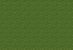
Tis a bit... empty I know. I spent 3 fucking hours getting that grass to be in any presentable form, and it still looks like total shit. Expect it to be filled up with objects as I find the time to draw them. I basically just repeated the grass tiles on the screen to show how it looks when used. Until then, thoughts and advice on the grass/palette? I totally fail at life when it comes to this crap...
Here are a few screen shots from my quest The Legend of Grenoro.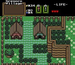
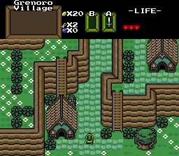
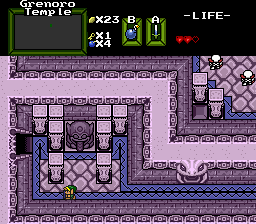
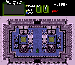
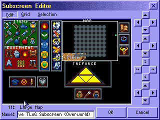
The subscreen is not completed.
What do you think?
russadwan wrote:Here are some before and after screenshots of my EoT remake:http://www.freewebs.com/russad/EoT%20Before%20%26%20After.bmpSorry it's a huge page, but there are a lot of images. So, I know I messed up a lot of them. I was wondering if anybody could show me what I need to improve in them.
Edit: Woops, sorry for the double post. Didn't realize I just posted. :banghead:

care to make it a substantially smaller file by saving it as a png? png files are substantially smaller then bmp files and png supports up to true colour as well. i fully agree with freedoms last post on the last page #640. next time revfan, just say what youthink is wrong and not outright declare it all a horrible mess. i fnd the image you dislike, somewhat good looking and dont see how the green stones can be bad o_O
Green rocks aren't extinct quite yet.

Also, this.

Spyk99999, can I ask what tileset you are using? That tileset looks incredibly flat, especially the pillars in the third and fourth shots and the eyeball statues in the fourth shot. I'm not saying your quest designing skills are bad, it's just the tileset. Also, I'm not too terribly fond of those hearts. Otherwise, those shots look good. I suggest using more decorations in the interior shots, like wall torches, regular torches, or at least something to give more color to them.
spyk99999 wrote:Here are a few screen shots from my quest The Legend of Grenoro.
The subscreen is not completed.What do you think?
First off, never, ever use JPGs. Use GIFs or PNGs for everything related to Zelda Classic.
Second, I commend the use of the Descendant Tileset. It's most certainly one of the better "Pure Clones" out there (Although technically the Descendant Set came first).
As per the screenshots, there's too many of the same tiles placed right next to each other. Vary up the detail a bit. Also, it looks like you have a number of combos that the player can walk into and get stuck from the other side (And it does show the player stuck up there in that first shot). Whether you have Smart Scrolling on or not, don't do that. It just makes your quest look extremely unprofessional and noobish.