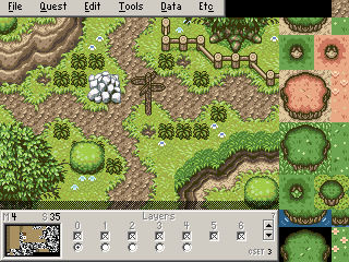
I don't really like the colors (Especially the greens). It doesn't show too well on that screen, but there's no black outlines on anything you ripped. That's just fine and all, except everything in DoR has an outline. Put them together, and they won't look right. Again, there's hardly any black outlines on anything in that shot, but I'm just saying...
It's also not too difficult to see that those tiles were NOT meant to work with that palette, especially the rocks. I don't even know what the originals look like but I have this wrenching feeling in my gut that there's a lot of color loss on them.
Hrm.
There are things I like about that new palette, and things that I don't.
I think I might use it, but I'll have to reduce the brightness.
Thanks.
russadwan wrote:But the new one would work for the sea of sand, wouldn't it Joe?
That area is the sea of sand...
Revfan9 wrote:I don't really like the colors (Especially the greens). It doesn't show too well on that screen, but there's no black outlines on anything you ripped. That's just fine and all, except everything in DoR has an outline. Put them together, and they won't look right. Again, there's hardly any black outlines on anything in that shot, but I'm just saying...It's also not too difficult to see that those tiles were NOT meant to work with that palette, especially the rocks. I don't even know what the originals look like but I have this wrenching feeling in my gut that there's a lot of color loss on them.
Well every thing in that shoot but the cliffs and enemies, oh and dirt, I ripped.
So what about the greens don't you like? I think the grass is a whole lot better than SD3 grass! And the rocks had very little color loose, and yeah those flowers were not meant to be in that palette, But they look good to me, and really that's what matters right?
Again, I've never seen those rocks in their original forms, but it very much looks like they have quite a bit of quality loss about them. Take for example, the MASSIVE contrast between the different levels of shading. But again, that could just be how they look in the original source and it could be a perfect rip. If so, I would suggest finding different rocks.
A few things wrong with that grass:
1. They're too dark and contrast far too heavily with the rest of the screen. Especially too dark for Grass. The grass should be detailed, yet blend into the background. With the proper colors that grass would look good, but the objects on the screen are supposed to stick out over the grass, not the grass sticking out over the objects.
2. (This kindof also explains why the first problem exists at all) They use the tree colors. Maybe this is my own opinion, but you should always always always use different colors for the grass. Always. If the trees and grass use the same colors, then you get the treetops blending in with the grass and the rest of the screen and it kindof makes everything meshed in. There's also the problem with doing that in 4-bit that means you have to do everything in 256 color or do everything on layers.
It's also good to note that both of these reasons is the same reason why DoR's SD3 grass looks so bad.
Also to go on a quick rant, am I the only person who hates the DoR palette structure with a passion? Seriously, it's so inflexible. It works for what the original DoR was supposed to be (Enhanced edits of Oracle and LttP tiles), but when you look at it, the structure clearly wasn't designed to do anything other than that. And now people are trying to do more complicated stuff with it and how poorly designed the palette structure originally was SHOWS.
And to say one more thing, I can't stress this enough. 3 grass colors is the ABSOLUTE MINIMUM for any tileset that wants to do anything above the level of the Pure tileset! Only having 2 doesn't work!
Kay, I'm done now.
Joe123 wrote:Hrm.
That area is the sea of sand...
It is. It seems very cliff filled. I was exoecting the sea of sand to be less rocky and more sandy.
Well, that screen is rather more mountinous; it's right on the border.
In the map which I posted, the screens below the top two rows make up the sand sea.
Mostly it's not too mountinous.
Other parts of the desert will be more so.
Then there's the endless desert, which will be less.
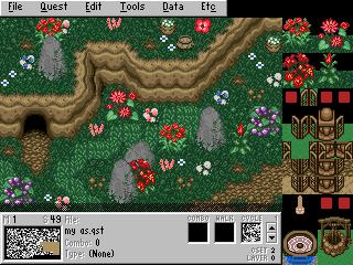
Rev do the rocks look better now?
New:
old:
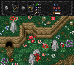
I personally like the grass as is, maybe I can find a happy meduim between DoR grass and current :shrug:
The palette is fine, my only real issue with it is that it got rid of my palette effect with all of the color gradients ending in purple.
Ennon: Those rocks look even worse now. At least they looked like rocks before, now they just look like flat gray blobs.
Oh I hadn't noticed, maybe that's why I wasn't so keen on your palette =P
The rocks look a lot better to me though. (the lighter coloured ones)
Joe123 wrote: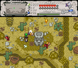
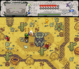
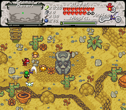
Hows about now?
Here is my advice. Keep the current palette, and use the new one for the endless desert. It has a mich more desolate look to it, making it better suiting for an endless desert.
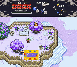
I had a poke around with your palette from earlier Rev, any suggestions anyone?
It's not great, but I think it could be ok with some work.
Obviously the screen design's a bit off still at the moment.
Joe123 wrote:
I had a poke around with your palette from earlier Rev, any suggestions anyone?
It's not great, but I think it could be ok with some work.
Obviously the screen design's a bit off still at the moment.
It looks nice. But why is it a dead end?
You know what, there are too many purple trees. Try using more green and less purple.
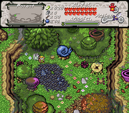
Because that's the first screen of the game 😉
And good point.
Joe123 wrote:
Because that's the first screen of the game 😉
And good point.
Much better now. But could we maybe start Link off without a hat, and have him find it with the sword? I don't know why, but I like hatless Link making a cameo.
Bleh, I'm not sure how much space there is next to the Link sprites.
I'll have a look in a bit.
Joe123 wrote:Bleh, I'm not sure how much space there is next to the Link sprites.
I'll have a look in a bit.
Oh ya, I forgot about all the Link Tile Modifiers. If it would be too much work, just scrap it.
Joe123 wrote:Because that's the first screen of the game 😉
And good point.
...Must... Kill... Stupid poofy swirly tree...
Revfan9 wrote:...Must... Kill... Stupid poofy swirly tree...
What don't you like about it? It's just the pegasus tree from the Pure set, redesigned to fit into the DoR perspective, and given some leaves to make it look more natural.
I like the tree :badrazz:
Any comment on the palette though?
I will admit, the blue coloring does look out of place there. But Revfan, if you look at the original pegasus tree, I think you will agree with me that Joe did a good job editing it.
I like lots of variety of colours too 😞
The original pegasus tree sucked, and as does it's new edit.
As for the palette, there's something horribly wrong with those browns. Maybe it's just that particular shot, but the different shades have way too much contrast with each other.
Revfan9 wrote:The original pegasus tree sucked, and as does it's new edit.
But the new one looks better, doesn't it?
Not really. The new one is best described as "too poofy" and the perspective is all out of whack.
Revfan9 wrote:Not really. The new one is best described as "too poofy" and the perspective is all out of whack.
Okay, it is kind of poofy, but it's in the right perspective, and it looks good poofy.
This one's from my testing of Jman's improvements to the scripting engine. 😊 For every lweapon sprite you see (up to 13), there is a script checking custom made collision handling for the 180 enemies on screen being moved by 10 ffc scripts per frame....or in other words, I'll soon post another screeny of what I believe I am able to further get on screen, oh, about 400+ singular entities all capable of harm. 😃
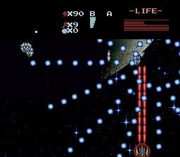
Anyway, I would appreciate some comments for bullet sprites, if you may have any suggestions...I'm not particularly pleased with these big round blue balls.
ps: I think this is a pallete that even revfan won't have any complaints about.
I can't complain about it because I can't see anything :/
It looks almost a solid black. The overly-simplistic "lazerz" is the only thing that shows.
Revfan9 wrote:I can't complain about it because I can't see anything :/
Exactally 😉
It looks almost a solid black. The overly-simplistic "lazerz" is the only thing that shows.
Well if you have something better then please let me know.