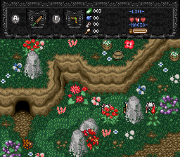
To comment on Evan's actual shots, aside from the bleached palette on the lower 2 screens, my biggest complaint is the "grass". I told /M/ the same thing. Use the god damn plain grass, anything other than that crap. Seriously, it looks like someone went around and dropped potato chips everywhere, then painted them green.
Secondly, ditch the "trunks" on those pine trees. Use something similar to what TMC used. It doesn't look right, that treetop wasn't meant to be used with those trunks, especially not pasted ontop like that. There's no transition.
Lastly, that "Dungeon" screen has nothing in it. It's completely empty. I can understand not putting enemies in that room since it's the entrance and all, but put some objects there. It does look like a test screen for those walls though, so I'll give you the benefit of the doubt on that one. But still, put more stuff in it.
Revfan9 wrote:To comment on Evan's actual shots, aside from the bleached palette on the lower 2 screens, my biggest complaint is the "grass". I told /M/ the same thing. Use the god damn plain grass, anything other than that crap. Seriously, it looks like someone went around and dropped potato chips everywhere, then painted them green.Secondly, ditch the "trunks" on those pine trees. Use something similar to what TMC used. It doesn't look right, that treetop wasn't meant to be used with those trunks, especially not pasted ontop like that. There's no transition.
Lastly, that "Dungeon" screen has nothing in it. It's completely empty. I can understand not putting enemies in that room since it's the entrance and all, but put some objects there. It does look like a test screen for those walls though, so I'll give you the benefit of the doubt on that one. But still, put more stuff in it.
LOL! Good old Revfan! I gusss the only thing to satisfy Rev's tastes is if that everyone's shots have true realism in them.
Now to comment on EtG (aka Evile), I'm very satisfied. I don't care about the grass. I actually think is unique. 😊
LOL Potato Chips!!! 😃
Link
This almost realistic enough for you Revfan?
Switch that to a realistic viewpoint halfway between straight-forward and top-down, and it should please him.
Nice level Joe! Yeah I saw it @ pure too
But this is a first time ever posting something of mine here so, here it is:
http://i165.photobucket.com/albums/u60/ennonfenom/Startingtownforitwoia.png
It's nice to see that the desire for perfection is still laughed upon in the ZC community :P
Joe123 wrote:http://i146.photobucket.com/albums/r260/Joe123ZC/EramusSandSea.png?t=1203893766
Aside from certain tile choices and the palette (It's not very realistic for a desert), it's alright.
Revfan9 wrote:Aside from certain tile choices and the palette (It's not very realistic for a desert), it's alright.
Oh wow, I was wincing when I saw you'd posted =P
How can I improve the palette?
I've never been to fond of it, but I don't know what to do to it.
I don't know much about palettes really.
I would edit the palette to show you what I mean, but you destroyed the color indexing, and it's really not worth the effort of rebuiliding it.
Try using something more like the palette from SD3.
When will Revfan get through his thick skull that ZC is NOT a PS3. Things can't 100% look real.
And? That doesn't mean that you can't make the best graphics within ZC's capabilities. It doesn't excuse bad graphics.
Revfan9 wrote:And? That doesn't mean that you can't make the best graphics within ZC's capabilities. It doesn't excuse bad graphics.
:sigh:
Just face it Rev, some users aren't trying to have the best graphics and some users aren't as experienced as you to get graphics up to the full capabilities of ZC. If you hunger for graphics then do it someplace other than ZC.
Evan the Great wrote:Link
This almost realistic enough for you Revfan?
I doubt it Evile. It's lacks certain qualities to satisfy him.
Joe123 wrote:http://i146.photobucket.com/albums/r260/Joe123ZC/EramusSandSea.png?t=1203893766
Question: How does Link get across the oasis when he does not obtain the flippers until after the desert. But otherwise, amazing!
TriMaster001 wrote::sigh:Just face it Rev, some users aren't trying to have the best graphics and some users aren't as experienced as you to get graphics up to the full capabilities of ZC. If you hunger for graphics then do it someplace other than ZC.
If people post screenshots, I'm going to comment on them. It's a screenshot. There's nothing to it but graphics. If there's a problem with the graphics that I see, I'm going to point it out. Knowing what's wrong is how you improve. Sure my criticisms are harsh, but the way I see it, there's no point in not being harsh. If there's something wrong and you don't let them know it, it's not going to be fixed. They won't improve as a quest maker. That's the entire problem with the ZC community. As a whole it prefers Dogma to Honesty.
I get your point but screenshots are also about gameplay. A screenie w/o gameplay is not a screenie at all, it's a painting. And that's not what a true game is all all about. Yes graphics are important but like what Nintendo thinks... Gameplay always rules over graphics. I agree that you need to critisize in order to make users improve, but let's face it, the ZC community is not made up of 1,000 Revfans. Everyone has their own style of quest making whether it could be for Classic, BS, Pure, DOR, etc. You critisize for one specific style as I critisize for any different styles becasue that's how a user is meant to build their quest. To point it all out, every user has their own style of questmaking.
What you don't seem to get is that it's a screenshot. It's pure appearances. you can't tell anything else from a screenshot alone other than how a game looks. If you want people to comment on your quest's gameplay, give a demo. You can tell as much about the gameplay of a quest from a screenshot as you can tell of the music from a screenshot ;/
Appearance isn't the only thing that matters in a game, you won't find anyone who agrees with that more than me, but it IS the only thing that matters in a picture.
Well showing of some new tiles, like grass I rip'd from Romancing saga 3 (Rs3)
and other stuff:

:sigh:
I give up. You're like the next Piers Morgan. :P
My main point is when u criticise, don't make a user go WAY too far to satisfy you. Make them improve with what they have.
ennonfenom wrote:Well showing of some new tiles, like grass I rip'd from Romancing saga 3 (Rs3)
and other stuff:
I like that grass a lot. It's better than the SD3 grass.
Yeah I thought so too. I am sure you noticed it in my qst file on tile page 41😃
If Revfan wants to criticise to those extremes TriMaster, then that's up for him to decide to be honest.
I appreciate harsh criticisms in general (perhaps not too far though), because I do feel like if I'm criticised then I can improve my work better, so in this situation then I'd prefer him to say that than 'oh yeah it's fine' or whatever.
What do you mean by the colour indexing being ruined Rev?
The palette isn't loaded correctly as it should show in ZC?
http://i146.photobucket.com/albums/r260/Joe123ZC/zelda061.png?t=1203957585
Could you show me with the palette from that one?
It's the same.
And Link doesn't get across the Oasis without the flippers Russ.
He comes back later 😉
The black outlining on your remaining DoR objects look awful I'm afraid ennon, you'd either have to completely remove them, or add them to everything.
Joe123 wrote:And Link doesn't get across the Oasis without the flippers Russ.
Oh. So, what lies beyond the oasis. Perhaps a stop in the trading sequence?
Yes, and a minigame for a heart container I think.
ennonfenom wrote:Yeah I thought so too. I am sure you noticed it in my qst file on tile page 41😃
I guess the only flaw is that the DOR trees don't mix well with the other trees.
Joe123 wrote:If Revfan wants to criticise to those extremes TriMaster, then that's up for him to decide to be honest.I appreciate harsh criticisms in general (perhaps not too far though), because I do feel like if I'm criticised then I can improve my work better, so in this situation then I'd prefer him to say that than 'oh yeah it's fine' or whatever.
What do you mean by the colour indexing being ruined Rev?
The palette isn't loaded correctly as it should show in ZC?
http://i146.photobucket.com/albums/r260/Joe123ZC/zelda061.png?t=1203957585
Could you show me with the palette from that one?
It's the same.
And Link doesn't get across the Oasis without the flippers Russ.
He comes back later 😉
The black outlining on your remaining DoR objects look awful I'm afraid ennon, you'd either have to completely remove them, or add them to everything.
Yeah, I can edit the palette in that one to show you can example.
OLD/NEW:
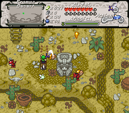
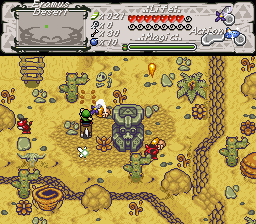
Well you got your point Joe. I still remember.
Old:
.....Rev's Criticism.......
New:

Revfan9 wrote:Yeah, I can edit the palette in that one to show you can example.
OLD/NEW:
I like that new palette, but I think the old one fits the area better. But the new one would work for the sea of sand, wouldn't it Joe? Revfan, would you mind if I submit that palette to go in the new DoR set?
Of course you can, most of those colors are taken directly from SD3's desert palette already.
Revfan9 wrote:Of course you can, most of those colors are taken directly from SD3's desert palette already.
Okay. Radien will probably want to add this.
Revfan9 wrote:Yeah, I can edit the palette in that one to show you can example.OLD/NEW:
I don't know? maybe a medium between the two? :shrug:
but yeah some more stuff to show the people here at agn: