Shane wrote:[CENTER]
Emerald Garden (Take 2)
[/CENTER]

That looks a bit better then the first take. Still without any enemies it looks very empty. But over all it looks nice.
Shane wrote:[CENTER]
Emerald Garden (Take 2)
[/CENTER]
That looks a bit better then the first take. Still without any enemies it looks very empty. But over all it looks nice.

Critiques and thoughts would be nice. :welcoming:
Lynker wrote:Critiques and thoughts would be nice. :welcoming:
Looking great... But here comes a complaint.
The tree in the bottom left corner looks a bit off, maybe you should remove it or maybe move it a bit more back away from the ledge.
Eh, looks fine in my opinion. :shrug:

Hmm... I might be doing a new project in this tileset, What does anyone think about my work with Newfirst?
I think that deserves a B. Basic and it looks good and plays good. 😊
Lynker wrote:I think that deserves a B. Basic and it looks good and plays good. 😊
Great shot, [MENTION=59516]Ventus[/MENTION]. My only complaint(besides the hideous subscreen) is next to the well detailed grass the plain ground looks odd. A few bits of dirt or rock will do wonders. Some might criticize it as being too square but I'm not pretending the tileset isn't made for squareness.
Lynker wrote:Critiques and thoughts would be nice. :welcoming:
Ventus wrote:
Hmm... I might be doing a new project in this tileset, What does anyone think about my work with Newfirst?
SUCCESSOR wrote:Great shot, [MENTION=59516]Ventus[/MENTION]. My only complaint(besides the hideous subscreen) is next to the well detailed grass the plain ground looks odd. A few bits of dirt or rock will do wonders. Some might criticize it as being too square but I'm not pretending the tileset isn't made for squareness.
Moosh wrote:
I really like this. If I might suggest something, close your corners ahem, I mean put something to spice up that bottom row of tiles and widen up the one tile wide spots (maybe put some trees below that square of bushes?). One tile wide spots really suck on screens with shooting enemies.
Thanks for the input, And I'll make sure to close those corners <.< (Man Open Corners really get to people :P)
Ventus wrote:
Thanks for the input, And I'll make sure to close those corners <.< (Man Open Corners really get to people :P)
Moosh wrote:No! Nonononono! This is what happens when we don't have the cross out text font option. I wasn't actually serious about the open corners thing. I was just joking. Open corners haven't caused problems since 2.5 allowed enemies to walk in them with a quest rule. Some people just have trouble moving on...
[strike]Yeah, we really need that ability...[/strike]
It's [noparse][strike] and [/strike][/noparse], if you ever need it in the future.
Moosh wrote:No! Nonononono! This is what happens when we don't have the cross out text font option. I wasn't actually serious about the open corners thing. I was just joking. Open corners haven't caused problems since 2.5 allowed enemies to walk in them with a quest rule. Some people just have trouble moving on...
Anyways here is the starting screen of this random project.
EDIT: I know I forgot to add some rocks and crap on the ground, But everything is subject to change :P
Another great screen. Is that section on the ledge part of a separate area or just for decoration? I kinda feel like that little path through the tall grass you have should have dirt, but that's just me.
ctrl-alt-delete wrote:[strike]Yeah, we really need that ability...[/strike]
CJC wrote:It's [noparse][strike] and [/strike][/noparse], if you ever need it in the future.
Oh goddamnit am I really that stupid? I assumed we didn't have it since it wasn't in the little bar next to bold, italicize, and underline.
Moosh wrote:Another great screen. Is that section on the ledge part of a separate area or just for decoration? I kinda feel like that little path through the tall grass you have should have dirt, but that's just me.
Yeah and the path should have something there. It seems like its missing something. Maybe its fixed in this one.
Ventus wrote:
This is a nice screen and all but it isn't nearly as good as the last one(which I noticed you removed). It loses the simplicity of the last image. The top corners are cluttered and the bottom edge of the screen is plain. Your grass detail is still nice besides that strange V shape in the bottom right. Where your last screen was nearly perfect in it's simplicity this one is highly flawed.
CJC wrote:It's [noparse][strike] and [/strike][/noparse], if you ever need it in the future.
Also [youtube]video#[/youtube] needs to be [yt=video#][/noparse]
Ventus wrote:About the ledge it might be another part of another area most likely.Yeah and the path should have something there. It seems like its missing something. Maybe its fixed in this one.
A screen of my own:

SUCCESSOR wrote:This is a nice screen and all but it isn't nearly as good as the last one(which I noticed you removed). It loses the simplicity of the last image. The top corners are cluttered and the bottom edge of the screen is plain. Your grass detail is still nice besides that strange V shape in the bottom right. Where your last screen was nearly perfect in it's simplicity this one is highly flawed.
Well I was trying to make the screen seem less empty. Maybe I went Over board? Anyways, I may take it back how the last one looked,
Which it is odd how Photo bucket deleted the one from before. Probably shouldn't have named the new one the same name as the old one <_<.
Oh well :|
bigjoe wrote:Cool to see that the Newfirst Tileset still gets used. I would suggest drawing a couple new tiles at the top of that extended tree with the cave in it,to fix the shading. (connect the light green spots)
I don't know though, I'll have to look though the tiles and see if there one, if not I'll edit it to make it look better.
bigjoe wrote:A screen of my own:
Very good. Nothing like Shrooms. :P.
I'd like to discuss what's bothering me about your screen, Ventus, and what might help.
Do you see the stump in the middle of the grass, there? It's from A Link to the Past. Whereas the rest of your tiles are Newfirst interpretations of various gameboy resources. Having spent a lot of time with Newfirst in my first (failed) quest attempt, I can tell you a little something about tile compatibility... you need to make sure the the 'angle with the viewer' matches from tile to tile.
In three-dimensional spatial graphing terms, the ALttP tiles form a small phi angle of roughly 8 degrees. That means that the game is almost exclusively top-down. Comparatively, the tiles from the gameboy games form a phi angle of roughly 30 degrees, meaning the camera is placed lower in the perspective and thus images are foreshortened on the top. You can clearly see this with the 'cake' mountain tiles, as the backside is much shorter than the front.
When you cross images that were designed for different camera angles, their differences become magnified. In this shot, the stump appears to be 'popping up' in the back, because it is not foreshortened like the other tiles on the screen.
To make this point more clear, let's look at bigjoe's screen.
Notice how the mushrooms appear to stand at the same angle as the trees? It makes them fit better with the rest of the tiles and thus reduces the amount of visual focus on them. They match.
What I recommend is finding the GB graphics version of a stumped tree, from the Oracles series, or creating a custom stump using one of the GB trees as a base.
Thanks, for the help CJC! I really appreciate it. I'll see what I can do about that tree stump. (It never really fit in there in the first place :P)
EDIT: Here is some more screenies!


These are all subject to change in the future.
Moosh wrote:Lynker, may I put forward a challenge? I want you to make a solid DoR screen using no custom tiles or palettes. This screen as well as a lot of your recent work just feels like it's using custom stuff as a crutch rather than a supplement. I think maybe if you designed your screens with default DoR tiles first and then swap them out for the custom ones later your screen design would improve immensely. When you have a huge-ass custom tile showcase going on it's easy to overlook nonsensical stuff like that random dirt to sand transition in the middle of a grassy field. I feel I should also add that MC moblins don't work at all when shrunk to 16x16 pixels. They just look silly.
Uh, Moosh, you do know tiles are meant to be used, right? The new tiles are used to enhance the game. Not just for them to be there. Your argument makes it sound like that I have to use classic for it to look good.
This is the worst advice I have ever heard.
Lynker wrote:Uh, Moosh, you do know tiles are meant to be used, right? The new tiles are used to enhance the game. Not just for them to be there. Your argument makes it sound like that I have to use classic for it to look good.
This is the worst advice I have ever heard.
Then what else is "wrong"?
To be honest, if it's unwise to use custom tiles, then how would have these wonderful tilesets such as Dance of Remembrance be made in the first place? =P
Also speaking of custom tiles:

No ground detail or finished subscreen but it's a start!
For starters, the screen feels really topheavy. Almost the entire top half of the screen is unwalkable. Screens like this can work when used in moderation, but I felt I should point that out. As long as you aren't doing this everywhere it should be fine. Also looking at the player's pathing options, this screen really encourages edge hugging. Might wanna keep that in mind too. I made a "tutorial" about screen flow and stuff. Mainly just my design philosophy. Feel free to accept or deny the stuff I say there. Not claiming any of this as solid fact.
Now let's examine those mountains. First of all, there's a tile error in the bottom left corner with the mountain backs. It should be only half a tile of mountain, not a full tile. Looking at the tops of the mountains, I see a big strip of empty tiles on the top left side of the screen and a big strip of detail on the bottom left. It just doesn't look natural to me. Real life mountains don't have screen borders and as such real life rocks aren't aware of screen borders. Realism? Not so much. Another conditional thing I'd like to add is that if either of those ledges are accessible you need to clear up some space and give them some sort of purpose. Otherwise I'll assume they aren't.
Looking at the ground there's the dirt to sand transition which I believed I've already covered. There's also the transition between the grass and the mountain on the bottom left section of the screen. The grass overlapping the mountain just looks really strange and messes with the perspective. IDK if that's a DoR default thing but I'd recommend changing it. The grass in relation to the castle is also very strange. It overlaps the castle on the horizontal sections, but not the diagonals or the base of the rightmost tower.
Finally, moving on to the castle tiles themselves there's a nasty perspective clash between the towers and the walls. The towers appear to have a more top-based perspective than the walls and don't even get me started on how it doesn't fit next to those DoR mountains. I think it would fit much better with gameboy perspective mountains. Maybe that last part's just me.
I remind you that you asked me to do this.
Shane wrote:To be honest, if it's unwise to use custom tiles, then how would have these wonderful tilesets such as Dance of Remembrance be made in the first place? =PAlso speaking of custom tiles:
No ground detail or finished subscreen but it's a start!
Moosh, I believe your opinion in the castle screen was a little too picky. I mean, sure, it is top heavy, but sometimes a screen like that is needed to make an overworld seem more like a world than an patterned jigsaw puzzle. I have at times made many top heavy, bottom heavy, and side heavy screens in my time, as long as I know there are many screens that are fully walkable.
I personally think the screen is beautiful amd perfect, I wouldn't change it for the world, but of course balance it out with walkable screens.
Shane wrote:To be honest, if it's unwise to use custom tiles, then how would have these wonderful tilesets such as Dance of Remembrance be made in the first place? =PAlso speaking of custom tiles:
No ground detail or finished subscreen but it's a start!
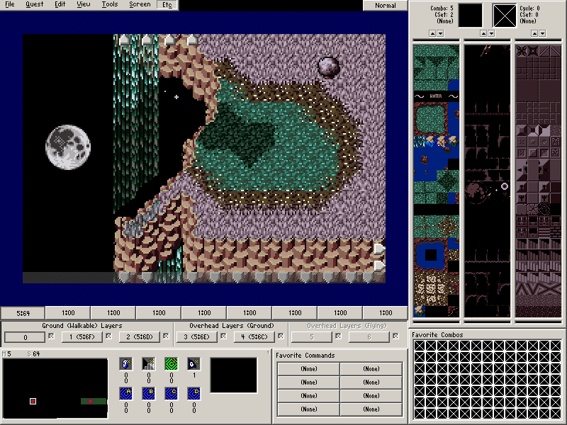
The colors are amazing (And fit the area), and the screen design works nicely. Though the shell on the mountain looks a bit strange, it also looks nice. The trees are also wonderful. A+
Quest for the Trident lives!
My first GB style screen:

Perhaps there's not enough open space, but its a work in progress.