This weeks featured shots come from...
_L_
"Anybody home?"
Amaster42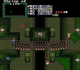
Hmmm, how to get past here...
LostInHyru1e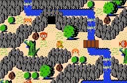
It's a bird! It's a plane! It's... Super Classic!
This weeks featured shots come from...
_L_
"Anybody home?"
Amaster42
Hmmm, how to get past here...
LostInHyru1e
It's a bird! It's a plane! It's... Super Classic!
L: too many styles and too many colors clash so badly it hurts. No vote here.
Amaster: Better, but I guess I'm an 'ol fashioned gal and I like my dungeon screens with a sense of 'closure'. So the open-ended feeling doesn't do it for me. Good design however, no vote here.
LIH: I like what you are doing with Classic to simulate mountain elevations. Voted.
_L_: Very good, nothign wrong here.
Amaster: It's good, but symetry doesn't go very well with SotW.
LostInHyru1e: I love classic! And this, this is beyond classic! It's amazing! *Votes*
_L_: I agree with DarkFlameWolf; too many colors, it just looks weird.
Amaster 42: Too gloomy and pale, I don't like it :/
LostInHyrule: Wow, this one looks amazing, proving the Classic tileset CAN look good *vote*
_L_: I like the pillars but the rest of the screen doesn't match.
Amaster 42:It's all right but a little to dark.
LostInHyrule:I've never seen Classic look so good.*vote*
_L_: I'm not a fan of the dungeon/overword mixture. The perspective gets really wonky and it's not attractive.
Amaster42: (I love your avatar!) The screen doesn't do anything for me though. I don't like the palette, and like DFW said, the openness isn't my cup o' tea.
LostInHyru1e: Not much to complain about. Aside from certain parts where there's very little walk room at the edges of the screen, it all looks pretty good. *votes*
Whenever I'm about to enter a screenshot, I should ask SotW to let me know if LostinHyru1e is going to be entering that same week, so I can hold back my submission for the week after. :evil:
I like Amaster's.
Thanks for the criticism, guys! I've also noticed that those columns tend to jar with the surrounding landscape. I suppose I might as well remove them, or replace them with a smaller, darker stone thing.
Now, anyway...
LostInHyru1e: It's pretty good, but those dark boulders clash with the bright colours of everything else. Maybe give them the gray tint of the rock walls?
Amaster42: The problem is that your palette is dreary. Even the crystal in the centre looks like it's filled with mud.
_L_ - Looks good. The colors seem to mesh well(with the exception of the pillars), and the design is solid. I like indoor/outdoor dungeons a lot.
AMaster- well designed for Gameplay. A little plain, as far as detail goes, but not a bad shot.
Sam Atoms wrote:Whenever I'm about to enter a screenshot, I should ask SotW to let me know if LostinHyru1e is going to be entering that same week, so I can hold back my submission for the week after. :evil:
You've made my day. 😃
*sigh* Yeah, one of the problems with making each dungeon feel really unique visually is that that then really limits your pallete and decoration choices.
_L_: Good, but crowded. A fine gameplay shot, but as eye candy it's a tad confusing.
LostInHyru1e: Very nice as always. Very...natural for classic, not very many straight lines or edges.