Didn't like any of the shots but according to my trusty six-sided die greyOx's was the best.
SotW 9 (winner is gray0x)
Sam Atoms wrote:The downloadable content on PureZC is great. It's the discussion forums that people have a problem with. It's essentially MySpace with zelda-themed conversations.
Nah, it's more like 4chan than it is like MySpace.
Well I actually kinda agree with Rev. Most of the tiles in PureZC are already in the tilesets.
gray0x
This one got my vote. It's open, yet, looks good at the same time. It's nice to see the old GB Pallette. Nice work!
Gleeok
I'm sorry, dood, but this is too repititious for my tastes. I'd imagine it would be a blast to play, but not material for a still screen-shot.
Mighty Darknut
It's alright. It's too empty for my tastes, but the design is alright. A little more detail, and this may have had my vote.
Revfan9 wrote:Nah, it's more like 4chan than it is like MySpace.
Well, whatever it's like, I like it. I've always felt more drawn to AGN, but Pure ZC has more activity and more member my age, so I post there more (although I visit both sites whenever I'm at the computer).
I updated my screen, if anyone's interested in seeing it: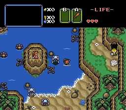
Much better. You should have submitted that one.
Sam Atoms wrote:The downloadable content on PureZC is great. It's the discussion forums that people have a problem with. It's essentially MySpace with zelda-themed conversations.
It's like zc 4-bit spriters design academy and feng-shui color management for the developing artist. Someone will post a project their working on and will always get replies about how they used 'bad' colors whether they wanted to hear them or not.
They've definitely got the best resources though. ...now if only they were up to date with the current zc capabilities.
Congrats gray0x with the successful minimalist design. Is that a full quest you're working on?
Gleeok wrote:It's like zc 4-bit spriters design academy and feng-shui color management for the developing artist. Someone will post a project their working on and will always get replies about how they used 'bad' colors whether they wanted to hear them or not.They've definitely got the best resources though. ...now if only they were up to date with the current zc capabilities.
Hey, I am up-to-date thank you very much... I have pictures to show it. The problem is that people want to work with unrealistic color management--Devoting thirty-two colors to a single little sprite is a bit of an overkill, especially when it comes to just one single event. It may be pretty, but it's not when it comes to having to put other things in later on. It's called keeping consistency to a real "console"--DS, GBA, GB/GBC, NES or SNES, whatever you choose, it's best to keep within that range, no more, no less. (So, for those who don't know, that would be 16 colors for a sprite. 32 colors are acceptable as a general sprite palette, given that those sprites keep within that range, but still use 16 or less colors.)
Oh, and finally Gleeok, the 4-bit thing isn't our fault; the lack of those who look for an alternate tileset instead of Classic is their own.
(Not to mention that I'm entering...)
Not to mention that, most of the time, when you use too many colors in a single sprite, the end result just looks bad. Keeping a lower amount of colors not only makes it easier on you and your tileset, it also will often make your graphics look more clean and appealing.
Sure you can use 16 shades of each color on a sprite, that's not a problem. The question is, should you use that many?
I voted for GrayOx, I liked the colors. 😊 Gleeok's shot has really good graphics, but is too repetitive.
mighty_darknut wrote:I updated my screen, if anyone's interested in seeing it:
Much better. I assume that ripples come at the top? I don't know what it is about the blue you use, but I absolutely love the blue. I don't know why, I just really like the blue you have. (Weird, I know, but I just had to say that.)
Blaman wrote:Much better. I assume that ripples come at the top? I don't know what it is about the blue you use, but I absolutely love the blue. I don't know why, I just really like the blue you have. (Weird, I know, but I just had to say that.)
Yep, ripples appear at the top. I like the blue too; I just tweaked Pure's palette a little bit, but I think it's a big improvement.