Well, I said I would do it this week, so I guess I have no real choice...
*ahem*
I'll start with the shot I hate the least, then move through them, saving the best rant for last.
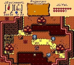
Joe123: Gets my vote. Far from a perfect example of GB graphics, but I haven't seen a good Subrosia-esque shot in a long time, so I'm liking this. The first and most obvious problem here is the lack of color. I know that it's a volcanic field, but not everything should be in shades of red. There should be some dullened greens somewhere, especially in the trees. Also, what's up with the weird golden brown on the Ganon rock? The second big problem I see is the lack of details. A lot of the same tile is used over and over again, and this makes looking at a lot of things just a flat-out eyesore, especially the lava. Seriously, replace that shit. It's terrible. The third problem is just the tile arrangement. Why are the edges of things placed on the edge of the screen? The emphasis should be on the center, with details on the edge to keep the viewer's eyes on the shot. The mountains and the lava are the biggest issues here. The last issues is just the consistency, especially with the grass/dirt transitions. Fix those.
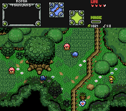
Blaman: Definitely fits with your username: It's Blah. I'm liking the use of Tales of Phantasia for the overhangs and the shadows from Treasure of the Rudras (courtesy of my rips, no doubt :P), but the perspective issues here leaves a lot to be desired. Aside from that, it's a very, very average Pure shot with some DoR graphics mixed in. Hate the bushes, especially the way those 2 on the right are overlapping. Bad. Fix that. There's nothing really wrong about the positions of anything here (aside from the overlapping bushes), what really kills this shot for me is the absolute staleness of the graphics. It's the same thing that we've all seen a million times. I know that having neat, original graphics aren't everything in a quest, but it means a LOT in a screenshot. Also, the pure grass. It fucking fails at life. Use the green rubber mat grass if you must, just anything but that shit. Seriously, it looks like some kid with ADHD took a crayon and drew all over the ground. If nothing else can be improved graphics-wise, at least change the grass. This one is arguably more well-composed than Joe's shot is, but Joe's tiles had a nice, fresh look and that's what won me over more than anything else.
Russadwan: HOLY MOTHER OF FUCKING GOD WHAT THE HELL DID YOU DO TO MY EARTHBOUND!?
Jesus Christ, this shot is an insult to all of humanity. I don't think I can spot a single tile in there which is actually used correctly, and all of the colors are immensely overly saturated. Seriously, what the fuck is wrong with you? You took one of the most memorable games of all time and fucked it right in the ass to produce this twisted hellchild of a screenshot. The colors look like someone decided to barf all over your moniter and you picked the colors based on the little food particles you saw. You took isometric graphics and tried to convert them to Zelda-perspective graphics without any sort of editing at all and the end result looks like donkey jizz.
Not to mention how the screen is so awfully composed. Objects are just placed randomly with no regard for their positions and there is almost no detail. Just looking at it makes me want to tear out my eyes and eat them.
The only way that this screenshot can possibly be forgiven is if you immediately delete all copies of this shot off of all web mirrors, then promptly melt your computer and make sure that you never use Zelda Classic ever again. Hell, better yet, chop off all of your fingers so that you never use a computer again in your life. It's the only way to stop this monstrosity from doing any more damage than it already has.