And this week brings us entries from LostinHyru1e, Russadwan, and Amaster42.
LostInHyru1e
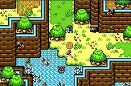
No Caption
Russadwan

As Link wanders through the desert, he finds a drought depriving the land of water, and shrinking once mighty rivers into tiny streams.
Amaster42

Welcome to Hyrule Town!
Russ- Nicely drawn desert screen. The design of the screen itself looks a little off(can you even get past the cactus on the right to get off the bridge?), there's lots of detail. I especially like the dead fish. Be even 5 times better if you animated it to make it flop around like it's gasping for air.
LostInHyrule- Very nice Gameboy screen. But I don't think you need to win at Pure and here.
Amaster42- Is that shot based off some game's hyrule town? I can't quite put my finger on it, but it looks familiar...
LostInHyru1e: Once again, your skill with the GB tileset amazes me. But try to add some variety to the trees.
Amaster: The top of the door in the wall looks kind of weird, but otherwise, it's amazing. It reminds me a little bit of Minish Cap's Hyrule Town.
Heh, actually based rather heavily off of Minish Cap Hyrule town. River down one side, a cliff-face through the middle, and that building on the one side that was a hotel? Now it's a library. 😊
Well, Amaster has 100% of the votes. All 1 of them. 😃
You put the poll options in a different order to the screens Amaster.
LiH all the way though.
Aw, no votes for me? Well, I'll get some. Eventually. I hope.
Yah, I noticed, but I'm not sure how to edit a poll after the fact. :shrug:
EDIT: *slaps head* Duh!
Heh, I was gonna say; just switch the screens round =P
You already did though.
And a headslap and everything!
Amaster42 wrote:And this week brings us entries from LostinHyru1e, Russadwan, and Amaster42.
You forgot to capitalize the "i" in the word "In" in LostInHyrule's name. :tongue:
Nothing too great this week. I voted for Amaster42. (I thought Revfan was going to enter...)
Come on! 2 each for the other people and none for me. And I though I'd at least get one vote.
I'll vote for you! Dead fish all the way!
Eh, voted for LiH. His shot isn't anything spectacular, but at least it's decent use of the GB Zelda tiles. Russ and Amaster's shots are just flat-out embarrassing.
No, Revfan's found us!
*Dives behind fence*
Revfan9 wrote:Eh, voted for LiH. His shot isn't anything spectacular, but at least it's decent use of the GB Zelda tiles. Russ and Amaster's shots are just flat-out embarrassing.
I would've voted for LIH, but he can't fucking use the mountains correcty. -_-'
I'm not crazy about the palette in russadwan's shot, but I voted for it.
Amaster42-Something about that waterfall looks odd. Maybe a border to keep the water from spreading sideways.
The lime green isn't one of my favorite colors, LostInHyrule. Otherwise I like it.
Just my opinions, what do I know? 🙄
Revfan9 wrote:Eh, voted for LiH. His shot isn't anything spectacular, but at least it's decent use of the GB Zelda tiles. Russ and Amaster's shots are just flat-out embarrassing.
Well, I have to say, I was expecting this. Well, actually, I though he would really insult my shot, so I got a better score from him thatn I thought I would!
mighty_darknut wrote:I would've voted for LIH, but he can't use the mountains correcty. -_-'
Ya, he does have that problem.
Saddest thing is that Russ's shot would have looked so much more awesome if he had just lowered the saturation and heightened the contrast on the palette. Something similar to this, maybe?
(Manually done GraphicsGale edit, ZC compatible)

(Color enhanced original image made in the GIMP, indexing lost)

Wow, Revfan, that palette is incredible! Much better than DoR's wateland palette!
Not really. Was a bit of a rush job, I've done much better.
This is probably because most of Radien's palettes really aren't so good...
Joe123 wrote:This is probably because most of Radien's palettes really aren't so good...
Well, they're a million times better than Pure's palettes are, so I'm happy with them.
Revfan9 wrote:Saddest thing is that Russ's shot would have looked so much more awesome if he had just lowered the saturation and heightened the contrast on the palette. Something similar to this, maybe?(Manually done GraphicsGale edit, ZC compatible)
(Color enhanced original image made in the GIMP, indexing lost)
Thank you! I'm glad I'm not the only one who realises that palette is horrid.
I think your second palette is pretty good, save for too much contrast in the browns. If you took the browns from the first palette and the reds/greens/blues from the second it would look nice.
Actually most of the DoR palettes are quite horrid -.-
Revfan- if he had gotten that palette, I'm sure his shot would've won flat-out. You're amazing.
Oh, and I'm honored to get Revfan's vote. :laughing:
Russ/Bobrocks- that fish is dead? I thought it was jumping out of the water?
mighty_darknut wrote:I would've voted for LIH, but he can't fucking use the mountains correcty. -_-'
Aww, aren't you sweet? 😉 No need to point out the specific errors, let's just bash! Fun fun! I want to be like you when I grow up.
EDIT:
BobRocks wrote:
LostInHyrule- Very nice Gameboy screen. But I don't think you need to win at Pure and here.
*Nods* Fair enough. I actually thought my shot was very mediocre, and didn't think I even had a chance at pure, so I entered it here too.
Revfan9 wrote:Actually most of the DoR palettes are quite horrid -.-
Really, I like most of them. Well, some (like the new Spring one) are horrid, but most are good.
LostInHyru1e wrote:Russ/Bobrocks- that fish is dead? I thought it was jumping out of the water?
It is. but if people think it's dead, let them think that. As long as I get votes for it, I'm happy.
So, when does SotW seven get posted?
Oops, double post. Sorry.
I was just getting round to it 😉
Seeing as we only have 2 entries this week, I'll throw in one of mine to make it up to three.