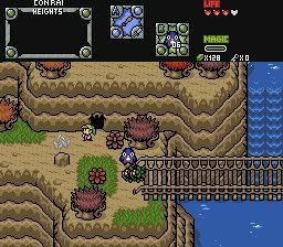
Meh, that's alright I guess. I'll just sit this one out 😛
Anyhow, let's tear all of these down. Lot of entries, but that's really to be expected. Nothing too special here in terms of tile selection, but ah well. Without any further adieu...
Plissken: This one gets my vote. It's a fairly well-made DoR shot, and I only have a couple of complaints. First off, there isn't much variation in terms of what's on the ground. There also seems to be a lot of walkability issues and it just feels overly crowded as a whole. I really don't like the perspective on the castle tiles. Fix that. Or better yet, get new ones altogether. Finally, the palette looks a bit washed out. I'm really a fan of low-saturation palettes, but the general rule with palettes is to make them high saturation, high luminosity, low saturation, low luminosity. Here, the palette is low-saturated, but it's bright as well. Either heighten the saturation, or darken it.
Russadwan: JPG... eww... The distortion of the JPG here really kills it, along with the dark, high-saturated palette. The shadows look just plain wrong and there's no variety anywhere, aside from the randomly placed trees. Along with the tile inconsistencies. The tile selection is nothing special either. I'm really starting to hate Radien for putting the SD3 grass in the DoR set, cause now we're seeing it being used in ugly shots everywhere. One last quip, why does the water look like radioactive dog shit?
Blaman: "Blah" really defines this shot. The general layout of the shot isn't too bad for the Pure tileset, my complaint with it is that there is far too much monotony with the mountains. Why couldn't more than 1 type of tree be used? And why not more details on the water? I also don't like some of the walkoff issues here, and the part at the top with the trees all lined up really hurts this shot... AND WHY IS IT JPG!?
Sam Atoms: A really, really basic GBZ shot. Same problem as the other screens, no variety on any of the tiles, not to mention the perspective issues as well as the tile errors and the really badly drawn sky.
Sharon: Big, empty, ugly palette, no ground details... etc. Repeats a lot of the same elements, making it just plain boring to look at. Not much else to say.
Joe123: First, I must commend you and Gleeock for being the only members on this poll to give us shots that aren't in Pure. Now on with it... Seeing that you used your FFA tileset, I have to give you points for creativity, but the rest of the shot fails. Color issues, space issues, perspective issues... Why is the castle shiny plastic?
Gleeock: "Hey guys, let's spill grey paint all over the screen, then put a shitload of plastic toy spaceships on it!" Nothing else needs to be said.