Pineconn 1
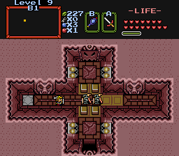
It's just a dungeon screen.
[hr]1[/hr]
Pineconn 2
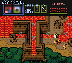
Fira! ...I mean, fire!
[hr]1[/hr]
Pineconn 3
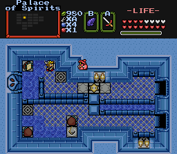
One of my favorite puzzles.
[hr]1[/hr]
Vote Pineconn 1, Pineconn 2, or Pineconn 3.
[highlight]Note:[/highlight] This is just a dummy thread. Tell me how to optimize the layout and it'll be done.
Maybe the words beneath the pictures *shrug*. Don't remember how Pure does it anymore, it's been a while.
I voted for Pineconn 1. Obviously Pineconn 2 needs to work on his screen design, and as for Pineconn 3; Well, maybe you need an easier tileset to work with....perhaps the LOZ tiles. 😛
Leave room for captions! ....umm, yay captions?
Names need to be above the pictures, looks sloppy how it is now. Captions are always fun too, I know how much Gleeok loves them. :P
Yeah, Pineconn 1. 2's lava just kinda annoys me, and 3 seems a bit...uneven?
All very nice though.
Lol, I like how you guys are taking it seriously. 😉 I just went through my Photobucket account and picked the first three somewhat presentable shots. 😉
Okay, I'll edit the layout a tad. Should I get rid of the lines?
Try centering them. That usually looks good.
I can't say I'm a fan of the centering...
That looks good. I like the seperation... :shrug:
Ah yes, captions. They are very doable....
I'm still not liking everything being centered. It seems too far to the right of the screen. 😛
Yeah, I agree actually, seeing it now, but before was too far left. Hmm, theres no middle ground? Maybe Indent tool?
I don't like the centering either. And don't put an empty space between the name and the screenshot. It looks fine like this:
Pineconn 1
"insert caption here, if applicable"
[INDENT][INDENT][INDENT][INDENT][INDENT]Pineconn 1
Pineconn 2
Pineconn 3
[/INDENT][/INDENT][/INDENT][/INDENT][/INDENT]
How's this?
Is there a reason why you don't want it totally left-alligned? I think it looks weird with the indents.
Pineconn wrote:
I'm still not liking everything being centered. It seems too far to the right of the screen. 😛
That's because you're sitting to the left of your monitor. 😉
That I was, that I was. 😛
I kinda like it how it is now. If nearly everybody doesn't like the space between "Pineconn 1" and the pic, I'll get rid of it. I personally like the space.
Yeah, that works fine. Although, see if you can have the dividers work off the font color; they show up poorly in the Classic Black skin.
Although, you should know that I win instantly in this competition. Here's proof:

😃
Not if I have anything to say about it! Oh, wait, I don't...*looks around for Revfan*
I'm using Classic Black and it looks fine...
And also, no, I win:

Number two is the best. Three is also pretty good. One is two basic.
Good to see you back ^_^
Did you have a nice time?
Joe123 wrote:Good to see you back ^_^
Did you have a nice time?
Ys, I did. And, I have a flight to catch in a few minutes, so I'll post info when I get back home. So, now I'm logging off. Good bye, and I'll will be back online possibly tonight, and probably by tomorrow.
I call this poll to a close. I win! 😃
Wow. I was sure you were going to lose. 😃
I think this poll was rigged. Pineconn's shot was clearly better than Pineconn's.
mighty_darknut wrote:I think this poll was rigged. Pineconn's shot was clearly better than Pineconn's.
I know. It had to have been rigged. It was rigged to make it where only Pineconn could win. Now we just need to figure out how he did it.