We now have a score of SotW contests! Let's keep the ball rolling!
@Chris Miller
@Gleeok
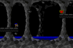
"Oh noes, they must have eaten all of the bats!"
@SUCCESSOR

Chris Miller
Gleeok
SUCCESSOR


We now have a score of SotW contests! Let's keep the ball rolling!
@Chris Miller
@Gleeok
"Oh noes, they must have eaten all of the bats!"
@SUCCESSOR


Hey! What happened to the captions? I can't vote without the captions!
This post contains the official Gleeok seal of approval. Look for these and other posts in an area near you.


My bad. It's coming. I'm rusty at this. My boy @Nimono is absent.


No problem. And look, I even remembered to take a screenshot this week.
For the shots:
@Chris Miller : Not enough Gleeoks.
@SUCCESSOR : Not enough Gleeoks.
@Gleeok : Needs more Gleeoks. Try harder next time guys.
*runs away*
*...but comes back really quick to tell Chris those column and rock tiles are theshit and then runs away again*
Voted for Chris Miller.
This post contains the official Gleeok seal of approval. Look for these and other posts in an area near you.


SUCCESSOR: Are those normal-size trees you have clustered together, or are my eyes deceiving me?


Loved your post, Gleeok.Definitely.
Some interesting screens! I like them all, albeit for different reasons. Mr. Miller's shot is unique due to the background, but there's not much happening in the foreground.
Gleeok's is awe-inspiring to consider for the layout of the Gleeoks on-screen, but there's not much happening in terms of screen design. It's just blocks and regular floors. If the actual screen were more interesting, I definitely would have voted for that.
SUCCESSOR'S screenshot is the first where the actual layout becomes important, as it's a commonplace adventure screen from a top-down perspective, not a pure action screen. It delivers on the layout and "interesting" part more than not, though there's always room for improvement, though when working with the base classic set, it's hard to say that with a straight face.


I voted for Chris's because it has a layer of mystery to it that the others do not, there's no visual way to get to the heart piece by any standard mobility methods except for getting there from the other side, the other pictures are very self-explanatory looking, or at the least a lot like other places, whereas Chris's looks like something newer.


I like Chris's more. While I like Gleelok's hoard of Gleeloks, Chris's is better I think for the same reasons Zim mentioned. Successor's seems like it would fit into an Nth quest, but still it lags shortly behind the others.
My Quotes and other siggy stuff.
*Bar-Buddies updates whenever-also can email comics upon request*
MP:89
Playing: Final Fantasy XIV


The results are in, and the winner is...
@Chris Miller!
Congratulations to the winning screenshot, and thanks to everyone for participating!

There are currently 1 users browsing this thread. (0 members and 1 guests)