User Tag List

View Poll Results: Which was the best?

Voters
13. You may not vote on this poll
  • SUCCESSOR

    5 38.46%
  • bigjoe

    5 38.46%
  • Nightmare

    0 0%
  • CJC

    2 15.38%
  • lineas

    1 7.69%
Results 1 to 7 of 7

Thread: Screenshot of the Week 19 [Tie - BigJoe & SUCCESSOR]

  1. #1
    Octorok Goriya's Avatar
    Join Date
    Apr 2013
    Age
    26
    Posts
    147
    Mentioned
    17 Post(s)
    Tagged
    5 Thread(s)
    vBActivity - Stats
    Points
    1,134
    Level
    11
    vBActivity - Bars
    Lv. Percent
    56.55%

    Cool Screenshot of the Week 19 [Tie - BigJoe & SUCCESSOR]

    Alright guys, SotW 19 is finally here...woo...and right, these are all Classic Shots, so that.

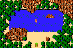
    @SUCCESSOR


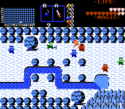
    @bigjoe


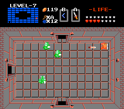
    @Nightmare

    Link getting a sword up his ass!

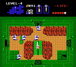
    @CJC

    "The wilds seep into the abandoned old dungeons, burying the ruins in an ever-rising layer of silt and mystery"

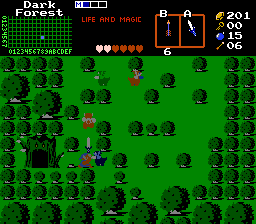
    @lineas

    Link's professors at Hogwarts warned him not to go into the Forbidden Forest, but did he listen?

  2. #2
    Username Kaiser SUCCESSOR's Avatar
    Join Date
    Jul 2000
    Location
    Winning.
    Age
    38
    Posts
    4,436
    Mentioned
    152 Post(s)
    Tagged
    7 Thread(s)
    vBActivity - Stats
    Points
    10,582
    Level
    30
    vBActivity - Bars
    Lv. Percent
    54.36%
    :O it's a tie! We can't have this! I MUST WIN!!! Jk.

    @bigjoe I really like your shot. It has that classic feel that mine lacks and still uses new tiles and new ideas.

    @Nightmare Link getting prison raped by guards is what comes to mind.

    @CJC I like the shot but I don't really care for mountains(though they look great with the green dungeon walls) in a dungeon and the Ghini's color makes them stand out in kind of a bad way. It also doesn't seem like a Ghini's type of joint.

    @lineas Wow that is a lot of green. I wish that tree with the entrance was brown or something and the placement of the trees(that Link has to navigate) seems very haphazard. If the green was broken up a little I would enjoy this shot much more.

  3. #3
    Admiral Zim's Avatar
    Join Date
    Oct 2012
    Posts
    388
    Mentioned
    9 Post(s)
    Tagged
    2 Thread(s)
    vBActivity - Stats
    Points
    1,721
    Level
    13
    vBActivity - Bars
    Lv. Percent
    90.77%
    I voted CJC's because Successor's right about the not blending, but that was clearly not the concept he was going for, and I liked the concept, and the bright green.

  4. #4
    OMNOMNOM 4matsy's Avatar
    Join Date
    Apr 2000
    Age
    43
    Posts
    1,554
    Mentioned
    2 Post(s)
    Tagged
    1 Thread(s)
    vBActivity - Stats
    Points
    1,954
    Level
    14
    vBActivity - Bars
    Lv. Percent
    70.17%
    @SUCCESSOR
    Pretty nice looking fairy pond you got here.
    @bigjoe
    Ooh, a snowy screen! :o Looks pretty painful, too, with all those Lynels. D:
    @Nightmare
    Meh...the new enemies are nice, but otherwise it's just an empty dungeon room. <_<
    @CJC
    I like seeing weird mixes of graphics in dungeons, but it helps if the proper enemies are there, too. I hope there's an explanation in the quest's story for why you'd have enemies like ghosts like Ghinis in a mountain-type dungeon...o_O
    @lineas
    HOOOOOOOOOOOOLY SNARFBLAM TOO MUCH GREEN

    --------------------------------------------------

    So. Let's assess our situation.

    lineas is right out because GREEN.

    Nightmare is out because plain.

    CJC is out because weird.

    Which just leaves SUCCESSOR and bigjoe.

    SUCCESSOR's shot is nice and all, and uses the tree and mountain tiles well (except for that part in the upper left corner where there are trees hovering over the water...uh, wut? o_O), though it is also Just Another Classic Tileset Fairy Pond(tm).

    bigjoe's shot is also pretty, and puts new tiles to good use. What little water there is compared to SUCCESSOR's shot is used wisely, and the enemies on display are 3 colors instead of just 1. However, the shot does suffer from the same All One Color(tm) syndrome lineas's shot did--it's just that snowy palettes are a bit more acceptable in this regard since they occur in reality as well.

    So I voted for bigjoe.
    "Walking around naked is a health issue. Forinstance, if you walk around naked and aren't a hot woman, people like me are a threat to your health when we start shooting at you."
    -Mottzilla

  5. #5
    Cor Blimey! CJC's Avatar
    Join Date
    Dec 2002
    Location
    Fading into the darkness
    Age
    36
    Posts
    1,398
    Mentioned
    150 Post(s)
    Tagged
    6 Thread(s)
    vBActivity - Stats
    Points
    6,640
    Level
    25
    vBActivity - Bars
    Lv. Percent
    4.41%
    Quote Originally Posted by 4matsy View Post
    @CJC
    I like seeing weird mixes of graphics in dungeons, but it helps if the proper enemies are there, too. I hope there's an explanation in the quest's story for why you'd have enemies like ghosts like Ghinis in a mountain-type dungeon...o_O
    The dungeon introduces the Hammer, which can be used to smash graves in the overworld. Ghinis are used as a visual 'hint' that you should head towards places with graves after you finish the dungeon (there are also a few graves in the dungeon, though not on this particular screen).


    I voted for @SUCCESSOR , because I felt it was an innovative new take on the staple fairy pond. While @bigjoe 's shot is lovely, I find myself perturbed by the big gumdrop trees (the little ones are great and I need to find them in the classic set, but something doesn't feel right about the big ones). @Nightmare 's screen is... daring. I have to say it's clever to submit a screen like that in this sort of contest. @lineas 's screen has great action, but I was distracted by the passive subscreen.

  6. #6
    Wizrobe Nightmare's Avatar
    Join Date
    Mar 2000
    Age
    45
    Posts
    2,523
    Mentioned
    40 Post(s)
    Tagged
    3 Thread(s)
    vBActivity - Stats
    Points
    3,862
    Level
    19
    vBActivity - Bars
    Lv. Percent
    80.66%
    I was trying to be more clever than artistic: I admit I'm not a good artist and sometimes have the programmer's perspective that block graphics work just fine for pictures: It's probably why I also surround myself with artists to help offset that bit of a problem.

    Just so everyone knows, I voted @SUCCESSOR . BigJoe's was a little too much out there for me.

    -James

    Facebook: http://www.facebook.com/nightmarejames YouTube: http://www.youtube.com/nightmarejames

    Game Projects
    Zelda Classic:
    Completed: Zelda NES Remastered, Demo 1st Quest, Demo 2nd Quest, James Quest: Remastered (V 2.1), Memorial Quest, New Quest 2 2015. New Quest: Rebuilt
    In development: Demo SP, James Quest: Remastered (V 3.0)t, 6QI

  7. #7
    Username Kaiser SUCCESSOR's Avatar
    Join Date
    Jul 2000
    Location
    Winning.
    Age
    38
    Posts
    4,436
    Mentioned
    152 Post(s)
    Tagged
    7 Thread(s)
    vBActivity - Stats
    Points
    10,582
    Level
    30
    vBActivity - Bars
    Lv. Percent
    54.36%
    We have our first tie! With 38.46% of votes each!

    @SUCCESSOR


    @bigjoe


    See the epic tie breaking battle: Screenshot of the Week 19: Tie Breaker

Thread Information

Users Browsing this Thread

There are currently 1 users browsing this thread. (0 members and 1 guests)

Posting Permissions

  • You may not post new threads
  • You may not post replies
  • You may not post attachments
  • You may not edit your posts
  •  
About us
Armageddon Games is a game development group founded in 1997. We are extremely passionate about our work and our inspirations are mostly drawn from games of the 8-bit and 16-bit era.
Social