User Tag List

Page 5 of 11 FirstFirst ... 3 4 5 6 7 ... LastLast
Results 41 to 50 of 108

Thread: Post Screenshots of Your Quests! [v2.0]

  1. #41
    Empty and become Moosh Moosh's Avatar
    Join Date
    Oct 2012
    Posts
    57
    Mentioned
    13 Post(s)
    Tagged
    4 Thread(s)
    vBActivity - Stats
    Points
    644
    Level
    9
    vBActivity - Bars
    Lv. Percent
    1.28%
    Quote Originally Posted by Ventus View Post
    Thanks for the input, And I'll make sure to close those corners <.< (Man Open Corners really get to people )
    No! Nonononono! This is what happens when we don't have the cross out text font option. I wasn't actually serious about the open corners thing. I was just joking. Open corners haven't caused problems since 2.5 allowed enemies to walk in them with a quest rule. Some people just have trouble moving on...

  2. #42

    Armageddon Task Manager

    ctrl-alt-delete's Avatar
    Join Date
    Jul 2001
    Age
    37
    Posts
    3,319
    Mentioned
    55 Post(s)
    Tagged
    6 Thread(s)
    vBActivity - Stats
    Points
    10,255
    Level
    30
    vBActivity - Bars
    Lv. Percent
    14.43%
    Quote Originally Posted by Moosh View Post
    No! Nonononono! This is what happens when we don't have the cross out text font option. I wasn't actually serious about the open corners thing. I was just joking. Open corners haven't caused problems since 2.5 allowed enemies to walk in them with a quest rule. Some people just have trouble moving on...
    Yeah, we really need that ability...


    <SUCCESSOR> Its Shadowblazer's dark essence invading the forums

  3. #43
    Cor Blimey! CJC's Avatar
    Join Date
    Dec 2002
    Location
    Fading into the darkness
    Age
    36
    Posts
    1,398
    Mentioned
    150 Post(s)
    Tagged
    6 Thread(s)
    vBActivity - Stats
    Points
    6,640
    Level
    25
    vBActivity - Bars
    Lv. Percent
    4.39%
    It's [strike] and [/strike], if you ever need it in the future.

  4. #44
    Gibdo
    Join Date
    Aug 2012
    Location
    waiting in hell for ya all
    Posts
    887
    Mentioned
    35 Post(s)
    Tagged
    6 Thread(s)
    vBActivity - Stats
    Points
    3,934
    Level
    19
    vBActivity - Bars
    Lv. Percent
    96.95%
    Quote Originally Posted by Moosh View Post
    No! Nonononono! This is what happens when we don't have the cross out text font option. I wasn't actually serious about the open corners thing. I was just joking. Open corners haven't caused problems since 2.5 allowed enemies to walk in them with a quest rule. Some people just have trouble moving on...
    I know you weren't being serious Moosh, Lol. I was just joking .

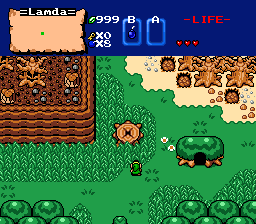
    Anyways here is the starting screen of this random project.


    EDIT: I know I forgot to add some rocks and crap on the ground, But everything is subject to change
    Last edited by Ventus; 12-15-2012 at 07:39 PM.

  5. #45
    Empty and become Moosh Moosh's Avatar
    Join Date
    Oct 2012
    Posts
    57
    Mentioned
    13 Post(s)
    Tagged
    4 Thread(s)
    vBActivity - Stats
    Points
    644
    Level
    9
    vBActivity - Bars
    Lv. Percent
    1.28%
    Another great screen. Is that section on the ledge part of a separate area or just for decoration? I kinda feel like that little path through the tall grass you have should have dirt, but that's just me.

    Quote Originally Posted by ctrl-alt-delete View Post
    Yeah, we really need that ability...
    Quote Originally Posted by CJC View Post
    It's [strike] and [/strike], if you ever need it in the future.
    Oh goddamnit am I really that stupid? I assumed we didn't have it since it wasn't in the little bar next to bold, italicize, and underline.

  6. #46
    Gibdo
    Join Date
    Aug 2012
    Location
    waiting in hell for ya all
    Posts
    887
    Mentioned
    35 Post(s)
    Tagged
    6 Thread(s)
    vBActivity - Stats
    Points
    3,934
    Level
    19
    vBActivity - Bars
    Lv. Percent
    96.95%
    Quote Originally Posted by Moosh View Post
    Another great screen. Is that section on the ledge part of a separate area or just for decoration? I kinda feel like that little path through the tall grass you have should have dirt, but that's just me.
    About the ledge it might be another part of another area most likely.

    Yeah and the path should have something there. It seems like its missing something. Maybe its fixed in this one.

  7. #47
    Username Kaiser SUCCESSOR's Avatar
    Join Date
    Jul 2000
    Location
    Winning.
    Age
    38
    Posts
    4,436
    Mentioned
    152 Post(s)
    Tagged
    7 Thread(s)
    vBActivity - Stats
    Points
    10,582
    Level
    30
    vBActivity - Bars
    Lv. Percent
    54.35%
    Quote Originally Posted by Ventus View Post
    This is a nice screen and all but it isn't nearly as good as the last one(which I noticed you removed). It loses the simplicity of the last image. The top corners are cluttered and the bottom edge of the screen is plain. Your grass detail is still nice besides that strange V shape in the bottom right. Where your last screen was nearly perfect in it's simplicity this one is highly flawed.


    Quote Originally Posted by CJC View Post
    It's [strike] and [/strike], if you ever need it in the future.

    Someone really needs to make a shorthand for this, [s]strikeout[/s]

    Also [youtube]video#[/youtube] needs to be [yt=video#]

  8. #48
    I shall exalt myself over all Armagedddon Games bigjoe's Avatar
    Join Date
    Apr 2000
    Age
    39
    Posts
    5,622
    Mentioned
    87 Post(s)
    Tagged
    6 Thread(s)
    vBActivity - Stats
    Points
    6,592
    Level
    24
    vBActivity - Bars
    Lv. Percent
    96.64%
    Quote Originally Posted by Ventus View Post
    About the ledge it might be another part of another area most likely.

    Yeah and the path should have something there. It seems like its missing something. Maybe its fixed in this one.
    Cool to see that the Newfirst Tileset still gets used. I would suggest drawing a couple new tiles at the top of that extended tree with the cave in it,to fix the shading. (connect the light green spots)

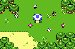
    A screen of my own:


  9. #49
    Gibdo
    Join Date
    Aug 2012
    Location
    waiting in hell for ya all
    Posts
    887
    Mentioned
    35 Post(s)
    Tagged
    6 Thread(s)
    vBActivity - Stats
    Points
    3,934
    Level
    19
    vBActivity - Bars
    Lv. Percent
    96.95%
    Quote Originally Posted by SUCCESSOR View Post
    This is a nice screen and all but it isn't nearly as good as the last one(which I noticed you removed). It loses the simplicity of the last image. The top corners are cluttered and the bottom edge of the screen is plain. Your grass detail is still nice besides that strange V shape in the bottom right. Where your last screen was nearly perfect in it's simplicity this one is highly flawed.
    Well I was trying to make the screen seem less empty. Maybe I went Over board? Anyways, I may take it back how the last one looked,
    Which it is odd how Photo bucket deleted the one from before. Probably shouldn't have named the new one the same name as the old one <_<.

    Oh well :|

    Quote Originally Posted by bigjoe View Post
    Cool to see that the Newfirst Tileset still gets used. I would suggest drawing a couple new tiles at the top of that extended tree with the cave in it,to fix the shading. (connect the light green spots)
    Yeah I thought about how the tileset doesn't get used that much. And I was like what the hell. Lets do this!.
    And about the extended tree, I think I have use the tiles wrong there. I think is a tile that was made that would look better.

    I don't know though, I'll have to look though the tiles and see if there one, if not I'll edit it to make it look better.

    Quote Originally Posted by bigjoe View Post

    A screen of my own:

    Very good. Nothing like Shrooms. .

  10. #50
    Cor Blimey! CJC's Avatar
    Join Date
    Dec 2002
    Location
    Fading into the darkness
    Age
    36
    Posts
    1,398
    Mentioned
    150 Post(s)
    Tagged
    6 Thread(s)
    vBActivity - Stats
    Points
    6,640
    Level
    25
    vBActivity - Bars
    Lv. Percent
    4.39%
    I'd like to discuss what's bothering me about your screen, Ventus, and what might help.

    Do you see the stump in the middle of the grass, there? It's from A Link to the Past. Whereas the rest of your tiles are Newfirst interpretations of various gameboy resources. Having spent a lot of time with Newfirst in my first (failed) quest attempt, I can tell you a little something about tile compatibility... you need to make sure the the 'angle with the viewer' matches from tile to tile.

    In three-dimensional spatial graphing terms, the ALttP tiles form a small phi angle of roughly 8 degrees. That means that the game is almost exclusively top-down. Comparatively, the tiles from the gameboy games form a phi angle of roughly 30 degrees, meaning the camera is placed lower in the perspective and thus images are foreshortened on the top. You can clearly see this with the 'cake' mountain tiles, as the backside is much shorter than the front.

    When you cross images that were designed for different camera angles, their differences become magnified. In this shot, the stump appears to be 'popping up' in the back, because it is not foreshortened like the other tiles on the screen.

    To make this point more clear, let's look at bigjoe's screen.

    Notice how the mushrooms appear to stand at the same angle as the trees? It makes them fit better with the rest of the tiles and thus reduces the amount of visual focus on them. They match.

    What I recommend is finding the GB graphics version of a stumped tree, from the Oracles series, or creating a custom stump using one of the GB trees as a base.

Thread Information

Users Browsing this Thread

There are currently 3 users browsing this thread. (0 members and 3 guests)

Posting Permissions

  • You may not post new threads
  • You may not post replies
  • You may not post attachments
  • You may not edit your posts
  •  
About us
Armageddon Games is a game development group founded in 1997. We are extremely passionate about our work and our inspirations are mostly drawn from games of the 8-bit and 16-bit era.
Social