User Tag List

View Poll Results: Vote for your favorite!

Voters
16. You may not vote on this poll
  • Ventus

    1 6.25%
  • Lynker

    5 31.25%
  • Seastorm

    4 25.00%
  • Shane

    1 6.25%
  • SUCCESSOR

    1 6.25%
  • Phazite

    2 12.50%
  • Majora

    2 12.50%
Page 1 of 2 1 2 LastLast
Results 1 to 10 of 11

Thread: Screenshot Of The Week 1 [Winner - Lynker]

  1. #1
    Gibdo
    Join Date
    Aug 2012
    Location
    waiting in hell for ya all
    Posts
    887
    Mentioned
    35 Post(s)
    Tagged
    6 Thread(s)
    vBActivity - Stats
    Points
    3,934
    Level
    19
    vBActivity - Bars
    Lv. Percent
    96.97%

    Screenshot Of The Week 1 [Winner - Lynker]

    Ventus

    Start of somthing random.

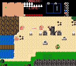
    @Lynker


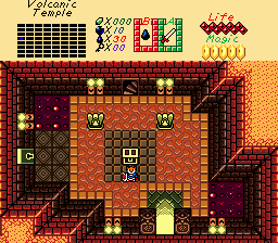
    @Seastorm

    The custom palette "Fire and Obsidian Dungeon" is free to rip and use.

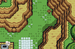
    @Shane

    I wonder what that sign says...

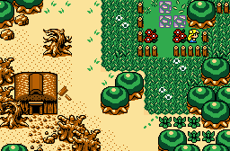
    @SUCCESSOR

    Between a meadow and a graveyard

    @Phazite


    @Majora


    -------------------
    Welcome to the first ever Screenshot of the week hosted on AGN. I hope you all enjoy, and don't forget to vote for your favorite.
    Last edited by Ventus; 11-18-2012 at 10:17 PM. Reason: Fixed poll, tags, and set poll timeout for 7 days. Get voting!

  2. #2
    Cor Blimey! CJC's Avatar
    Join Date
    Dec 2002
    Location
    Fading into the darkness
    Age
    36
    Posts
    1,398
    Mentioned
    150 Post(s)
    Tagged
    6 Thread(s)
    vBActivity - Stats
    Points
    6,640
    Level
    25
    vBActivity - Bars
    Lv. Percent
    4.41%
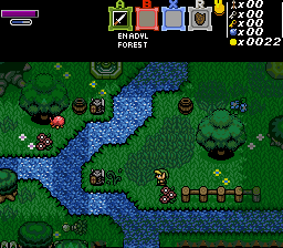
    @Lynker wins my vote, mainly because of the high-quality scenery and water effects. The shot also features an excellent sub-screen and captures the enemies barreling down on Link. It's full of action.


    I've got some comments on the other images, as well. Take them or leave them as you please.

    @Ventus
    This is a good showing of a classic screen, particularly because of your use of edging combos to break the transition from sand to grass. Your sub-screen is a little plain, though, you may wish to consider replacing the map with an image of your over-world or removing it entirely and spreading out your other markers a little more.

    @Seastorm
    You've got a good custom GameBoy set there, and the sub-screen has an Alundra vibe (Alundra is one of my favorite games of all time, so that wins you bonus points). Still... a dungeon entrance isn't the best place to start with a screenshot. There's very little happening in the room, both due to its lack of enemies and also due to its lack of puzzle components. Of course it shouldn't have either of those things, being a dungeon entrance, but... as a contest submission you want the shot to have some mystery.

    @Shane
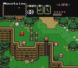
    The mountains are excellent. But... the screen is in the middle of nowhere. I know connecting screens are necessary in quests, and not every one can have something going for it, but this screen just doesn't feel like the right choice for contest material. It needs more.... Enemies, trees... I dunno.

    @SUCCESSOR
    The transition is too abrupt. Sorry. Also, the vibrant color of the woman and the flowers clashes with the subtle tones of the background. If you're using it to make those things stand out, then the step-stones need to be less vibrant.

    @Phazite
    I just couldn't get enthused about this shot. Maybe it's the sub-screen. Either that, or the screen needs some blue. It's very... green.

    @Majora
    You were neck-in-neck with Lynker, especially for your excellent use of lighting. But the shot feels... empty. I know for a fact the quest this shot comes from is full of action. If you put forth a dungeon shot, or possibly a dungeon exterior, you'd win my vote for sure next round.

  3. #3
    Octorok Shane's Avatar
    Join Date
    Aug 2012
    Location
    Australia
    Age
    27
    Posts
    210
    Mentioned
    43 Post(s)
    Tagged
    8 Thread(s)
    vBActivity - Stats
    Points
    1,554
    Level
    13
    vBActivity - Bars
    Lv. Percent
    29.15%
    I agree on the lack of enemies, I would have added some but I'm building this tileset from ground up - enemies is something I still need to add to the tileset.=P

    Also SUCCESSOR is beating me!? *Flips a table with lots of stuff over and walks out in rage* Okay I'm obviously kidding, good screens guys!

  4. #4
    Sir Anthony Brasel's Avatar
    Join Date
    Aug 2001
    Age
    40
    Posts
    6,559
    Mentioned
    35 Post(s)
    Tagged
    9 Thread(s)
    vBActivity - Stats
    Points
    9,896
    Level
    29
    vBActivity - Bars
    Lv. Percent
    69.11%
    @Ventus has my vote. I love the classic look.
    Talga Vassternich -- Deserve Victory

    --------------------------------------------------------

    Check out my YouTube channel! I'm doing video game reviews and retrospectives from the NES/SNES eras.
    I also now have a webpage: www.braselthegamer.com
    Contributor for Gaming Rebellion! Columnist of the new series Breakdown!

  5. #5
    Gibdo
    Join Date
    Aug 2012
    Location
    waiting in hell for ya all
    Posts
    887
    Mentioned
    35 Post(s)
    Tagged
    6 Thread(s)
    vBActivity - Stats
    Points
    3,934
    Level
    19
    vBActivity - Bars
    Lv. Percent
    96.97%
    @Seastorm Has won my vote; Gotta love that game-boy screen. and nice looking sprite for the player. But I say. you need some enemies in that. screen badly

    And great turn out guys!

    Thanks for the entry's everyone!!!

  6. #6
    Faith, Trust, and Sexydust. Lynker's Avatar
    Join Date
    Oct 2012
    Posts
    113
    Mentioned
    33 Post(s)
    Tagged
    14 Thread(s)
    vBActivity - Stats
    Points
    944
    Level
    10
    vBActivity - Bars
    Lv. Percent
    66.17%
    [QUOTE=CJC;891165] @Lynker wins my vote, mainly because of the high-quality scenery and water effects. The shot also features an excellent sub-screen and captures the enemies barreling down on Link. It's full of action.

    Thanks so much, CJC! A nice review of my shot like this is real nice. And thanks for voting for me!

  7. #7
    Username Kaiser SUCCESSOR's Avatar
    Join Date
    Jul 2000
    Location
    Winning.
    Age
    38
    Posts
    4,436
    Mentioned
    152 Post(s)
    Tagged
    7 Thread(s)
    vBActivity - Stats
    Points
    10,582
    Level
    30
    vBActivity - Bars
    Lv. Percent
    54.36%
    Oh my. There is too much competition for my poor little shot.

    @Ventus This shot is very nice. I do have a couple problems. The colors of the mountains just don't seem to fit the rest of the screen and I find those cross gravestone clash with the rest of the tiles.

    @Lynker I love this screen like I do all your screens but it feels a little crowded an over detailed.

    @Seastorm Very nice. Very very nice! I am hard pressed to find something about this screen not to like. I think the floor tiles by the doorways could use some different colors.

    @Shane I have told you how much I love this shot. I'd make babies with this shot!

    @SUCCESSOR spectacular work as always. You sir are an absolute genius and should be commended for your contribution to humanity.

    @Phazite I love the different trees on the bottom and very nice work with the mountains. No complaints what so ever.

    @Majora OMG what is this disaster?! JK. I love the simple look and design. I do think the squareness of the light/shade does more harm than good and the different trees clash a bit.

  8. #8
    Gibdo
    Join Date
    Aug 2012
    Location
    waiting in hell for ya all
    Posts
    887
    Mentioned
    35 Post(s)
    Tagged
    6 Thread(s)
    vBActivity - Stats
    Points
    3,934
    Level
    19
    vBActivity - Bars
    Lv. Percent
    96.97%
    Quote Originally Posted by SUCCESSOR View Post

    @Ventus This shot is very nice. I do have a couple problems. The colors of the mountains just don't seem to fit the rest of the screen and I find those cross gravestone clash with the rest of the tiles.
    Thanks!, I've been having some thoughts about changing the mountain color. I guess I should go and edit them. to make them look a little bit better.
    And the grave's, I was trying to go for realism. Graveyards in real life has different graves and some are dilapidated.

  9. #9
    Wizrobe
    Join Date
    Dec 2006
    Age
    30
    Posts
    3,693
    Mentioned
    3 Post(s)
    Tagged
    0 Thread(s)
    vBActivity - Stats
    Points
    8,954
    Level
    28
    vBActivity - Bars
    Lv. Percent
    45.51%
    Phazite got my vote. It's a nice, old-school screenshot that really caught my attention.
    Quote Originally Posted by rock_nog View Post
    Well of course eveything's closed for Easter - don't you know of the great Easter tradition of people barricading themselves up to protect themselves from the return of Zombie Christ?


  10. #10
    Lynel
    Join Date
    Jan 2005
    Posts
    1,296
    Mentioned
    0 Post(s)
    Tagged
    1 Thread(s)
    vBActivity - Stats
    Points
    3,350
    Level
    18
    vBActivity - Bars
    Lv. Percent
    61.42%
    I voted for Shane. I'm a sucker for ALttP mountains, and these are nicely used, and the added touches and details on the screen look very nice.

    The rest are good, but none really stand out among the many ZC shots that exist today. This was a pretty good turn out though. Hopefully SotW is always this active

Thread Information

Users Browsing this Thread

There are currently 1 users browsing this thread. (0 members and 1 guests)

Posting Permissions

  • You may not post new threads
  • You may not post replies
  • You may not post attachments
  • You may not edit your posts
  •  
About us
Armageddon Games is a game development group founded in 1997. We are extremely passionate about our work and our inspirations are mostly drawn from games of the 8-bit and 16-bit era.
Social