Joe123
No Caption
1
CastChaos
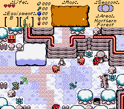
Spring on Mt.Dead End.
1
gray0x
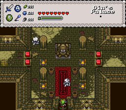
It's a dungeon and stuff.


Joe123
No Caption
1
CastChaos
Spring on Mt.Dead End.
1
gray0x
It's a dungeon and stuff.

Ahh! You didn't wait for me. Which is fine, because I didn't even start to make a screen yet…
Sooo,
I'm voting for Joe!

I'm nulling for I am in. Otherwise Joe pulled off an insane GB greatness. The variety is high. So me-a vote there.
Joe: not your best GB screen, but still pretty good.
CC: Very nice. The cliff tile on the right side looks a little strange. Then again, I do the same thing, so I don't blame you there. DoR mountains can be hard to use sometimes. :)
gray0x/Lithium: I like this one a lot. The walls themselves are symmetrical, but the overall screen isn't because of the floor. Very nice.
Tough to vote this week, but I think I'm voting for CastChaos. The way he uses DoR mountains makes me feel better about not being able to figure them out completely.

I choose Joe. His has the best continuity (In my opinion)
Currently working on Legend of Zelda: Hero's End (Oringinally Zelda 2.5, but plot changed)
Overworld: 100%
Underworld 30%
Dungeons: 13/14
And now for an irrelevant comment...
So, we're back to our own shots?
Cool. Joe's is nice, and aesthetically pleasing with good colors, and layout. I like CC's colors, but the ground is too repetitive. Grey0x's dungeon shot is ok, but I'm not a fan of narrow, and symmetrical designs :/
Vote goes to Joe.
Obviously I didn't vote cause I entered.
Gray0x's is pretty nice, although a few diagonal sections might do the walls some good.
CC's screen is just not well designed.
The amount of walkable area is restricted to the point at which you're just about squeezing through 1 combo passageways to get round. Then there's the wall one combo from the edge at the bottom which you'll walk into the moment you enter the screen there.
Then if you look a bit closer, it becomes apparent that there actuallly isn't anything to do on that screen anyway...
I might be missing something, but I certainly can't see anything of any consequence on that screen.
It's a dead end with over-restricted walking area, why would anyone even walk onto it?
The palette's not amazing too. I don't know if it's a DoR default or a custom palette, but either way it looks pretty horrible. The greens look almost sick-coloured, and the screen's just too brown overall.
That mountain error on the right is just horrible.
Usually I don't like it when people keep moaning about tiny tile errors in mountains, but this just looks awful. Awful along the lines of 'DoR mountains used in a Z1 style'. You can't just decide you want a great big wall on the right and stick a line of a tile there and expect it to work.
Those small blue splodges also aren't doing the screen any good either. What are they meant to be?
They look like peanuts or something.
Detail can do a screen good, but just picking random graphics and throwing them down isn't helping at all.
I don't think the overhand rain layer's helping either, it just appears to be obscuring the screen...
I like his greens, and blues (trees specifically). I think the blue "peanuts" are supposed to be puddles. I do agree with the bad use of mountains, but I think the screen is meant to be a dead end. My only real complaint is too much dirt. The detailed DoR default dirt tile looks bad when repeated so much. The line of tiles on the right also does pose some perspective questions, and ultimately looks bad. Not bad over-all, but it is a far cry from the best screen ever.
Voted for Joe. As usual, CastChaos, removing the rain from the shot might help a bit... and a bit of action might help, too. Joe once again proves his skills with GBZ, anyway.
You post as though you've seen it all before, and yet you only have 2 posts?
Are you from PZC or summat?
There are currently 1 users browsing this thread. (0 members and 1 guests)
Posting Permissions