


Specifically talking about the combo tool tips here, but it's likely a problem elsewhere too. The information that is needed is usually all there, but it's presented in a bad way.
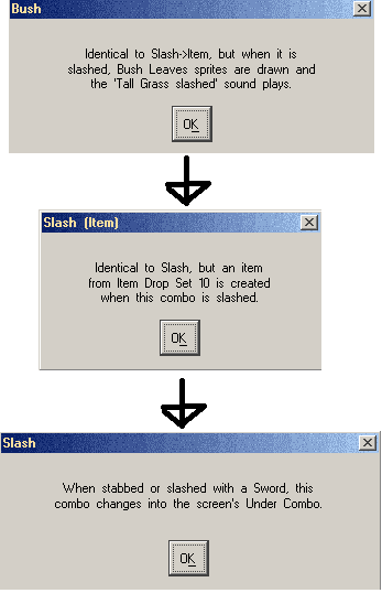
Say for example that I don't know what the bush combo type does (or that I want a quick reminder to make sure I'm using the desired combo type), so I open up the tooltip. This is the tooltip chain you need to do to get all the information you wanted:
Splitting up the data like this to force the user to go on a clue hunt to get all the information, and it's kind of counter productive. Sure, it's all there, but is there any reason why the combo tool tip for Bush just couldn't go over all the information there? Screen space is not an issue for the pop-ups, so just providing something full fleshed that gets you all the information would be better.
Here's an example for how the Bush tool tip could be:
It's not even that much longer from how it is now:When stabbed or slashed with a sword, this combo changes into the screen's Under Combo. An item from Item Drop Set 10 is also created and Bush Leaves sprites are drawn; Furthermore the 'Tall Grass slashed' SFX plays.
But it skips the hurdle of having to read three tool tips to get all the information. (Which is way more text in total to read anyway...)Identical to Slash->Item, but when it is slashed, Bush Leaves sprites are drawn and the 'Tall Grass slashed' sound plays.

 Reply With Quote