


About the ledge it might be another part of another area most likely.Originally Posted by Moosh

Yeah and the path should have something there. It seems like its missing something. Maybe its fixed in this one.


About the ledge it might be another part of another area most likely.
Yeah and the path should have something there. It seems like its missing something. Maybe its fixed in this one.


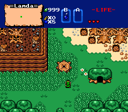
This is a nice screen and all but it isn't nearly as good as the last one(which I noticed you removed). It loses the simplicity of the last image. The top corners are cluttered and the bottom edge of the screen is plain. Your grass detail is still nice besides that strange V shape in the bottom right. Where your last screen was nearly perfect in it's simplicity this one is highly flawed.
Someone really needs to make a shorthand for this, [s]strikeout[/s]
Also [youtube]video#[/youtube] needs to be [yt=video#]
Cool to see that the Newfirst Tileset still gets used. I would suggest drawing a couple new tiles at the top of that extended tree with the cave in it,to fix the shading. (connect the light green spots)
A screen of my own:
Well I was trying to make the screen seem less empty. Maybe I went Over board? Anyways, I may take it back how the last one looked,
Which it is odd how Photo bucket deleted the one from before. Probably shouldn't have named the new one the same name as the old one <_<.
Oh well :|
Yeah I thought about how the tileset doesn't get used that much. And I was like what the hell. Lets do this!.
And about the extended tree, I think I have use the tiles wrong there. I think is a tile that was made that would look better.
I don't know though, I'll have to look though the tiles and see if there one, if not I'll edit it to make it look better.
Very good. Nothing like Shrooms..

I'd like to discuss what's bothering me about your screen, Ventus, and what might help.
Do you see the stump in the middle of the grass, there? It's from A Link to the Past. Whereas the rest of your tiles are Newfirst interpretations of various gameboy resources. Having spent a lot of time with Newfirst in my first (failed) quest attempt, I can tell you a little something about tile compatibility... you need to make sure the the 'angle with the viewer' matches from tile to tile.
In three-dimensional spatial graphing terms, the ALttP tiles form a small phi angle of roughly 8 degrees. That means that the game is almost exclusively top-down. Comparatively, the tiles from the gameboy games form a phi angle of roughly 30 degrees, meaning the camera is placed lower in the perspective and thus images are foreshortened on the top. You can clearly see this with the 'cake' mountain tiles, as the backside is much shorter than the front.
When you cross images that were designed for different camera angles, their differences become magnified. In this shot, the stump appears to be 'popping up' in the back, because it is not foreshortened like the other tiles on the screen.
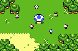
To make this point more clear, let's look at bigjoe's screen.
Notice how the mushrooms appear to stand at the same angle as the trees? It makes them fit better with the rest of the tiles and thus reduces the amount of visual focus on them. They match.
What I recommend is finding the GB graphics version of a stumped tree, from the Oracles series, or creating a custom stump using one of the GB trees as a base.
There are currently 1 users browsing this thread. (0 members and 1 guests)
Posting Permissions

 Reply With Quote
