User Tag List

Page 1 of 8 1 2 3 ... LastLast
Results 1 to 10 of 74

Thread: Large Mode: the official topic

  1. #1
    Developer
    ZC Developer

    Join Date
    Aug 2006
    Location
    Australia
    Age
    37
    Posts
    2,777
    Mentioned
    2 Post(s)
    Tagged
    0 Thread(s)
    vBActivity - Stats
    Points
    6,850
    Level
    25
    vBActivity - Bars
    Lv. Percent
    37.58%

    Large Mode: the official topic

    Large Mode is the new interface for ZQuest. It looks like this: http://img291.imageshack.us/img291/3259/zelda002kd3.gif

    It features the following primary attributes, in order of importance:
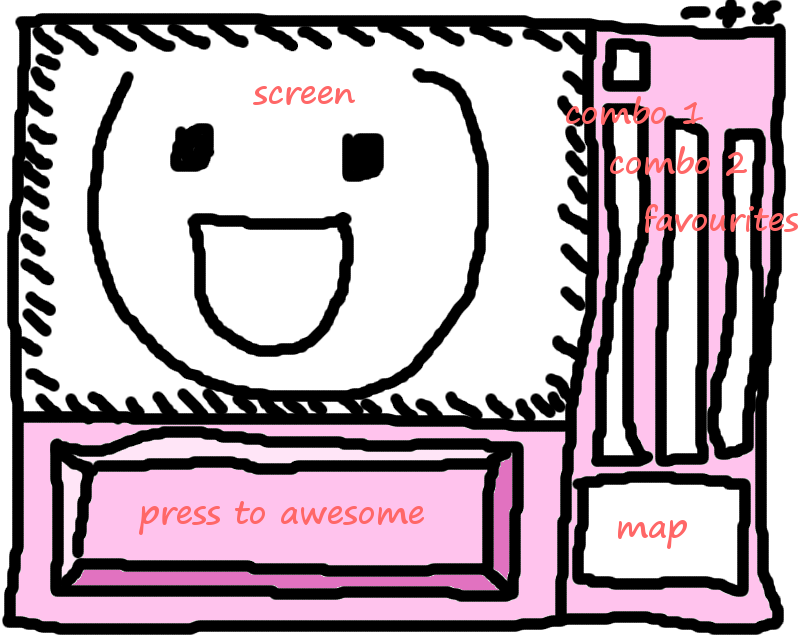
    * Main Screen
    The main screen is twice as large as in Small Mode, and includes a Screen Edge Preview showing the adjoining rows and columns of the adjacent screens.

    * Screen Tabs
    You can have 9 screens 'open' simultaneously. The tabs display the screen number of the screen that they are set to.

    Current disadvantage: don't look tab-shaped.

    * Layers Bar
    It should always be possible to instantly tell how many layers a particular screen has, and which layer you are currently working on. To that end, this Layers Bar exists. Layers are grouped by type, and the visibility of each can be toggled with a checkbox. The screen number of the screen for that layer is displayed on the button.

    * Combo Selectors
    Three selectors allow you to select combos from three different places in the combo list simultaneously. The currently selected combo is displayed atop. Also present: buttons that advance the lists of combos, in a manner similar to Shift-Page Up and Shift-Page Down.

    Current disadvantage: apparantly people find three selectors intimidating?

    * Main Panel
    Previously the only panel in Small Mode. It houses the important Minimap, which lets users choose a screen from the current Map to work on.
    The Main Panel contains the following pages of options, which can be selected with the row of buttons beneath:
    * Main. Displays the selected combo's number, type, tile, walkability, and cycle. Also, the name of the currently open quest file.
    * Flags. The only way to place the Item location square, as well as the 'legacy squares', which are the Green Square and the Stair Square. And, there's a square that lets you place more of the most recently selected Combo Flag.
    * Screen Flags. Shows some of the current screen flag settings for this screen, as well as the Enemy Flags and the Enemy Pattern. Current disadvantage: not very useful at all. Likely to be cut?
    * Room Type. Displays the current Guy, String, Room Type, and Catch All value (which will usually be the Special Item).
    * Tile Warp. Displays some of the settings for Tile Warp A and Side Warp A. Current disadvantage: no room for warps B, C and D.
    * Maze Path. Shows the Maze Path settings. That's it. Likely to be cut?
    * Nothing. Since Layers are now controlled by the Layers Bar, this button will be removed.
    * Warp Returns. The only way to place the Warp Return squares. The most important panel?
    * Preview. In Preview Mode, the panel displays the key commands for Preview Mode.

    * Commands
    Select a command that you use often, so that you don't have to use the menu bar all the time. Personal recommendations: Tiles, Combos and Compile ZScript.

    Current disadvantage: takes up a bit of space. Could it be a dropdown menu?

    * Favorites
    Place your most commonly-used combos in this panel. Current disadvantage: do we really need that many spaces?


    So, let's discuss ways to improve this interface. Some starting questions:

    1) Should the Main Panel be larger? Should Commands be integrated into it? Should the Minimap take up more of the screen? Should we replace the icon buttons with text buttons? Which panels should be cut? Can we put the most useful functions into a single panel?

    2) Should the Screen Tabs be moved somewhere else? Above the screen, or below the Layers Bar?

    3) Do Commands and Favorites take up too much space? Are the Combo Selectors a bit too tall? Are the combos themselves too small? Could we do fine with just two Combo Selectors or even one?

  2. #2
    On top of the world ShadowTiger's Avatar
    Join Date
    Jun 2002
    Location
    Southeastern New York
    Posts
    12,231
    Mentioned
    31 Post(s)
    Tagged
    3 Thread(s)
    vBActivity - Stats
    Points
    29,578
    Level
    46
    vBActivity - Bars
    Lv. Percent
    60.3%
    Achievements It's over 9000!

    Re: Large Mode: the official topic

    My Opinions:

    1) The Minimap could stand to be a bit larger. Some people are a tad blind, and can't really spot a 3x3 pixel block that well. Perhaps shrink the panel buttons in the lower left corner into a 4x2 space below the panel they represent, and enlarge the minimap? Once someone learns pageup and pagedown, they don't use those buttons much anymore, really.

    2) Would it be possible to "enlarge" the Tiles Pages so they're not as hard to see anymore? Essentially, it'd mean having two modes for it: Enlarged, and Screenshot-Compatible. Hell, hitting the "screenshot compatible" button would really just take a screenshot, and halve the size of the image to emulate compatibility before reduction even takes place, as it's already taken the screenshot as the proper size with no visible difference to the screenshot taker.

    3) Commands are Favorites are perfectly fine, -if- they're nothing else to take their place. If someday we discover another possibility, I can imagine us alternating between the Commands and Favorites area, and some other thing that'd fit into the same space.

  3. #3
    Bored Potato Nicholas Steel's Avatar
    Join Date
    May 2005
    Age
    35
    Posts
    4,380
    Mentioned
    4 Post(s)
    Tagged
    2 Thread(s)
    vBActivity - Stats
    Points
    10,292
    Level
    30
    vBActivity - Bars
    Lv. Percent
    19%

    Re: Large Mode: the official topic

    - try removing the thick borders around things, things like the "command" buttons are pretty huge, dividers between the 3 combo selectors on the right is pretty wide, the menu bar itself can be shorter in height, etc.

    - increase the size of the minimap

    - change/remove the icons for the buttons under the minimap.

    - have support for pinned dialog boxes

    - as a matter of personal preference, I preferred the old skool font that used to be used in all the dialogs before they were "enlarged" :/

    - move the "screen tabs" above the main screen, but under the "menu bar"
    Computer specifications:
    Windows 10 Pro x64 | Intel Core i7 @ 2.66GHZ | Asus P6T Motherboard | 6GB DDR3 RAM | Integrated Sound | Nvidia Geforce 560 Ti 2048MB PCI-E | Corsair AX760 Power Supply | Thermaltake Armor+ MX case

  4. #4
    Wizrobe
    Join Date
    Dec 2006
    Age
    29
    Posts
    3,693
    Mentioned
    3 Post(s)
    Tagged
    0 Thread(s)
    vBActivity - Stats
    Points
    8,935
    Level
    28
    vBActivity - Bars
    Lv. Percent
    42.86%

    Re: Large Mode: the official topic

    Here's what I think about it. It's a nice interface, but it's too big. I'm used to windowed mode standard editor. And then comes large mode. For people used to small mode, it's too big. For people new to ZC, it's too confusing.
    Quote Originally Posted by rock_nog View Post
    Well of course eveything's closed for Easter - don't you know of the great Easter tradition of people barricading themselves up to protect themselves from the return of Zombie Christ?


  5. #5
    Lynel
    Join Date
    Jul 2005
    Posts
    1,726
    Mentioned
    0 Post(s)
    Tagged
    0 Thread(s)
    vBActivity - Stats
    Points
    4,605
    Level
    21
    vBActivity - Bars
    Lv. Percent
    37.7%

    Re: Large Mode: the official topic

    Maybe put the minimap in place of the favourites box, so it's bigger. And replace the third combo section with a favourites section. ???

  6. #6
    Octorok Linkus's Avatar
    Join Date
    Oct 2006
    Age
    34
    Posts
    181
    Mentioned
    0 Post(s)
    Tagged
    0 Thread(s)
    vBActivity - Stats
    Points
    1,181
    Level
    11
    vBActivity - Bars
    Lv. Percent
    77.59%

    Re: Large Mode: the official topic

    Eh, it's the window itself - that's the problem. Everything's crammed into one window, and you can't change/move things around, or remove and add other stuff; It's just not customizable at all.

    Here's a few things that should be in a separate window:
    • Combo List. One per window is enough; let the user decide how many lists he or she wants to have at a time. Also, take the search and other abilities from the Combo Editor, and include them into that window.
    • Tabbed lists. Organization is key - Resources aren't really marked properly as of right now. With this master list, different resources such as items, weapons, tile pages, combos, and sound effects are separated to different directories and files.
    • DMap List. Not do you just have the Dmap name and type in an easy and accessible list form, you also have each screen listed, and their warps marked to where they go, and the items that are there. An advanced view could also keep track of combo IDs and various flags.
    • Item Tracker. Heart Container Pieces, rupees, and quest-specific items are tallied here, along with location and conditions.
    • Minimap, nothing else to say about that.
    That's all I can say.

    EDIT: Thought of something else - a Comment section. Screens and Dmaps are what it's for, to make notes about the screen. For example, an unset warp because the destination screen wasn't made yet. Also, include a notepad, letting people write down things that are specific to that quest.

  7. #7
    Robots in Disguise
    ZC Developer
    Dark Nation's Avatar
    Join Date
    Mar 2000
    Posts
    5,401
    Mentioned
    0 Post(s)
    Tagged
    0 Thread(s)
    vBActivity - Stats
    Points
    7,657
    Level
    26
    vBActivity - Bars
    Lv. Percent
    61.63%

    Re: Large Mode: the official topic

    Suggestions are good. Keep them coming. But it's a lot easier to see what someone is talking about if they create a mockup for their vision.

  8. #8
    Wizrobe
    Join Date
    Dec 2006
    Age
    29
    Posts
    3,693
    Mentioned
    3 Post(s)
    Tagged
    0 Thread(s)
    vBActivity - Stats
    Points
    8,935
    Level
    28
    vBActivity - Bars
    Lv. Percent
    42.86%

    Re: Large Mode: the official topic

    What Linkus was saying gives me an idea. Make it fully customizable.

    For example, let's say that rather than have a favorites menu at the bottom right of the screen, I want it to be commands. So I click ETC-Customize. I click on the favorites, and choose something else (in this case commands, but it could be anything). And then it rearanges them to put the thing I asked for there. Or if I wanted the far right combo list to be combo alliases, I coulkd do the same thing, click on the third combo list, and choose combo alliases to have them be out there.
    Quote Originally Posted by rock_nog View Post
    Well of course eveything's closed for Easter - don't you know of the great Easter tradition of people barricading themselves up to protect themselves from the return of Zombie Christ?


  9. #9
    Lynel
    Join Date
    Jul 2005
    Posts
    1,726
    Mentioned
    0 Post(s)
    Tagged
    0 Thread(s)
    vBActivity - Stats
    Points
    4,605
    Level
    21
    vBActivity - Bars
    Lv. Percent
    37.7%

    Re: Large Mode: the official topic

    This is the general idea I was trying to convey in my previous post:


  10. #10
    Lynel
    ZC Developer
    pkmnfrk's Avatar
    Join Date
    Jan 2004
    Location
    Toronto
    Age
    37
    Posts
    1,248
    Mentioned
    0 Post(s)
    Tagged
    0 Thread(s)
    vBActivity - Stats
    Points
    3,141
    Level
    18
    vBActivity - Bars
    Lv. Percent
    10.37%

    Re: Large Mode: the official topic

    Quote Originally Posted by russadwan View Post
    Here's what I think about it. It's a nice interface, but it's too big. I'm used to windowed mode standard editor. And then comes large mode. For people used to small mode, it's too big. For people new to ZC, it's too confusing.
    How do you know? You're not new to ZC. And, very few people who are new to ZC use the betas (or, at least, talk about them).

    The thing about small mode is that it was great -- up until it switched to the Windows-style GUI. Then, it became awkward. From something that looks like Windows, I expect certain Windows-like behaviour. Dragging the title bar of a sub window should move the window (this should be addressed in large mode too), etc. Under DOS, we didn't have these assumptions.

    Quote Originally Posted by Linkus View Post
    Eh, it's the window itself - that's the problem. Everything's crammed into one window, and you can't change/move things around, or remove and add other stuff; It's just not customizable at all.

    Here's a few things that should be in a separate window:
    • Combo List. One per window is enough; let the user decide how many lists he or she wants to have at a time. Also, take the search and other abilities from the Combo Editor, and include them into that window.
    • Tabbed lists. Organization is key - Resources aren't really marked properly as of right now. With this master list, different resources such as items, weapons, tile pages, combos, and sound effects are separated to different directories and files.
    • DMap List. Not do you just have the Dmap name and type in an easy and accessible list form, you also have each screen listed, and their warps marked to where they go, and the items that are there. An advanced view could also keep track of combo IDs and various flags.
    • Item Tracker. Heart Container Pieces, rupees, and quest-specific items are tallied here, along with location and conditions.
    • Minimap, nothing else to say about that.
    That's all I can say.

    EDIT: Thought of something else - a Comment section. Screens and Dmaps are what it's for, to make notes about the screen. For example, an unset warp because the destination screen wasn't made yet. Also, include a notepad, letting people write down things that are specific to that quest.
    Much of that stuff I do using an external document, as it is both easier and more flexible.

    My biggest suggestion would be to augment the Favourites panel. Maybe have it so that you can toggle it between the Favourites and the Mini Map (since, it's unlikely you'll need both at the same time).

    Or, if you want to go hog-crazy, add a multi-window dialog system, if that's at all possible in Allegro! Float the Mini map, Favourites and even the command bar!
    Tale of the Cave - a web comic - Updates Monday, Wednesday, Friday
    ZC Tutorials - Tutorials and Script Library - Updated July 30, 2008
    ZeldaGuard - Corruption in my save files? It's more likely than you think!
    I do script requests!

Thread Information

Users Browsing this Thread

There are currently 1 users browsing this thread. (0 members and 1 guests)

Posting Permissions

  • You may not post new threads
  • You may not post replies
  • You may not post attachments
  • You may not edit your posts
  •  
About us
Armageddon Games is a game development group founded in 1997. We are extremely passionate about our work and our inspirations are mostly drawn from games of the 8-bit and 16-bit era.
Social